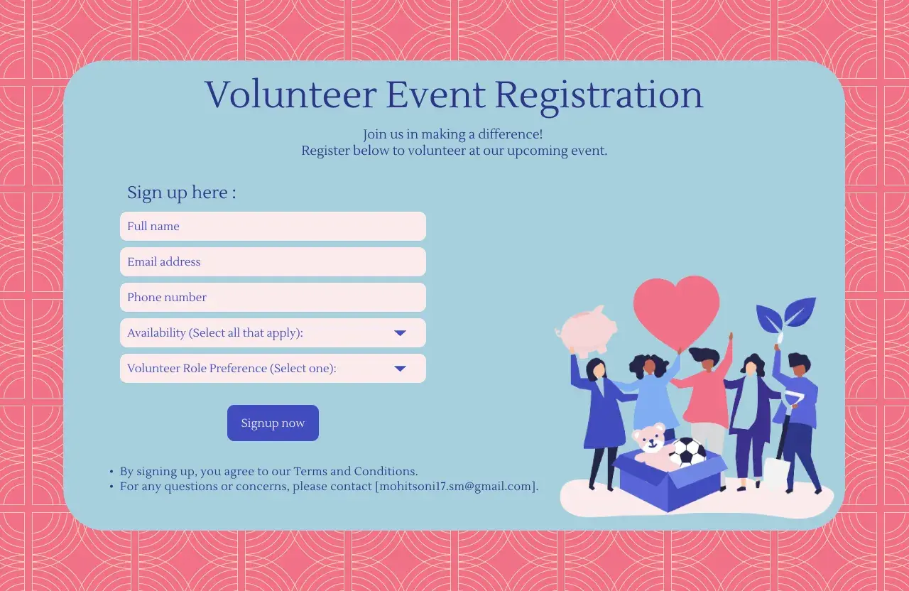
Volunteer website design works best when it helps people understand the mission, find the right role, and sign up without friction. For a nonprofit, that means the site has to do more than look credible; it has to support recruiting, onboarding, scheduling, and follow-through inside your volunteer software stack. In practice, the strongest sites combine clear storytelling, calm visual hierarchy, and forms that feel quick enough to finish on a phone.
The essentials for a volunteer site that converts interest into action
- Lead with a clear mission, a direct call to action, and one obvious path to volunteer.
- Keep the visual design warm and trustworthy, but do not let imagery bury the next step.
- Make sign-up, onboarding, and shift selection work smoothly on mobile, not just desktop.
- Connect the website to volunteer management or CRM tools so staff do not manually re-enter data.
- Use accessibility basics from the start, including contrast, keyboard use, alt text, and plain language.
- Remove uncertainty by showing time commitment, location, requirements, and contact names up front.
What volunteers are actually trying to solve
Most visitors are not arriving to admire your branding. They are trying to answer a practical question: Can I help here, and what will it take from me? That is why the best volunteer pages are built around decision-making, not decoration. They should make it easy to compare opportunities, understand the time commitment, and see whether the role fits a volunteer’s schedule, skills, and comfort level.
In the United States, that usually means being explicit about things people often hesitate to ask: local time zones, age requirements, background checks, driving or parking logistics, physical demands, and whether a role is one-time or recurring. If a visitor has to email to get the basics, the site is already adding friction. I would rather answer those questions directly on the page and let the interested person move forward with confidence.
That shift in thinking changes the whole site structure, because once the page is built around the volunteer journey, the layout and content start doing real work instead of just looking polished.
Build the page structure around the volunteer journey
I usually think of a volunteer site as a sequence of decisions: learn, compare, commit, and prepare. The homepage should not try to explain everything. It should point people toward the next useful step with as little hesitation as possible.
- Hero area with one primary call to action, such as “Find a volunteer role” or “Join our volunteer list.”
- Current opportunities or role categories that let people see where they fit without digging through menus.
- New volunteer path that explains what happens after sign-up, in plain English.
- Training and onboarding resources for people who need to prepare before their first shift.
- Mission and impact proof that shows why the work matters and who benefits.
- Contact and response expectations so people know who will follow up and how quickly.
That structure works because it matches how volunteers actually move. First they look for relevance, then they check whether the task is realistic, and only then do they commit time. I like to keep the navigation simple enough that a first-time visitor can understand the site in seconds, not minutes. If your volunteer hub has more than a few major paths, group them by role type or commitment level instead of making people sort through an endless menu.
Once the information architecture is clear, the next problem is emotional: the site still has to feel welcoming, trustworthy, and human enough to make someone stay.
Make it feel inviting without turning it into a poster
A volunteer site should feel optimistic, but it should never feel vague. The visual system needs warmth, yet it also has to support fast scanning. That balance is where many nonprofit sites drift off course. They use lovely photos and generous spacing, but they bury the actual action behind a soft, unfocused homepage.
Here is the design balance I look for:
- Use real people whenever possible. Authentic volunteer photos usually work better than generic stock images because they make the mission feel lived-in.
- Keep typography highly readable. Big headlines help, but body text, labels, and helper copy matter more because they carry the decision points.
- Use color for hierarchy, not decoration. One strong accent color for calls to action is enough on most nonprofit sites.
- Leave enough whitespace so sections breathe, especially on mobile screens where clutter becomes overwhelming fast.
- Show trust cues like staff names, response time, volunteer testimonials, and partner logos where they are relevant.
I also avoid the common trap of making the site feel emotionally heavy. Good community work deserves dignity, but the site still needs momentum. That means clear buttons, short paragraphs, and a page rhythm that moves from context to action without drama. If someone is ready to help, the design should not slow them down for aesthetic reasons alone.
Once the site feels clear and credible, the next bottleneck is usually the sign-up flow itself, which is where a lot of volunteer interest quietly disappears.
Treat sign-up and onboarding as part of the design, not afterthoughts
This is where volunteer website design either succeeds or fails. A beautiful homepage does very little if the form is long, confusing, or disconnected from the actual onboarding process. I prefer to think in stages, because not every question belongs on the first form.
| Stage | What to ask for | What to avoid here |
|---|---|---|
| Interest capture | Name, email, basic interest area | Waivers, long bios, and every possible field at once |
| Role application | Availability, skills, preferred role, eligibility questions | Anything unrelated to placement |
| Onboarding | Emergency contact, training steps, policy acknowledgements, required documents | Re-asking the same information in a different format |
I separate those stages because volunteers often start with goodwill but limited time. If the first form feels too demanding, they postpone it, and “later” usually means never. A better pattern is to collect only what is necessary to move them forward, then use the next screen or email to gather the rest.
Logic-based forms help here. If someone says they are interested in recurring weekend shifts, the site should show relevant options instead of every possible role in the organization. If a role needs a certification, ask for that only when it matters. The point is not to be clever with automation. The point is to reduce noise.
For nonprofits, I also recommend a clean handoff into CRM or volunteer management software. A signup that lands in an inbox and sits there waiting for manual processing creates delay, and delay weakens trust. The best systems confirm the submission instantly, explain what happens next, and route the record to the right staff workflow.Once the onboarding flow is behaving, the software choice becomes much easier to evaluate, because you can see whether the site needs a simple front end or a deeper operational backbone.
Choose nonprofit software that matches your volunteer volume
Not every organization needs the same stack. A neighborhood food pantry with occasional weekend shifts has a very different need from a statewide nonprofit running recurring volunteer programs, training, and multi-step approvals. The right system should fit the scale of the program, not force the program to fit the software.
| Approach | Best for | Strength | Tradeoff |
|---|---|---|---|
| Simple website plus forms | Small programs and event-based volunteering | Fast to launch and easy to maintain | More manual follow-up and less automation |
| CMS plus CRM integration | Growing nonprofits that want better data flow | Centralized records and cleaner communication | Requires setup and some process discipline |
| Dedicated volunteer management software | Recurring shifts, approval workflows, training, and reporting | Better scheduling, onboarding, and volunteer tracking | More configuration and a higher learning curve |
| Portal-style intranet or hub | Organizations with active volunteer teams and internal resources | One place for updates, files, and role-specific content | Needs clear governance or it becomes cluttered |
Microsoft’s Volunteer center template is a good example of the portal approach because it organizes a home page, new-volunteer area, training resources, files, and quick links into one central hub. That matters when volunteers need orientation as much as they need opportunities. A structure like that is useful when the program has enough moving parts that people should not be left piecing everything together from scattered pages.
My practical rule is simple: if volunteers need recurring access to schedules, materials, and staff contacts, invest in a real system. If they just need a clear route into a few events, a simpler setup may be enough. Either way, the software should support the content structure, not fight it.
That leads directly into the next requirement, because even the best software stack fails if the site is hard to use on a phone or impossible for people with different abilities to navigate.
Accessibility and mobile behavior are not optional
Accessibility is not a separate “nice to have” layer on top of the design. It is part of whether the volunteer site works at all. W3C’s accessibility guidance treats mobile accessibility as part of the broader WCAG-based approach, which is the right lens here: many volunteers will first view your site on a phone, during a commute, between shifts, or while standing in line.
- Use strong color contrast so buttons, labels, and body text remain readable in sunlight and on smaller screens.
- Make buttons and form fields large enough to tap comfortably without precision.
- Label every field clearly so users understand what to enter even if they are using assistive technology.
- Support keyboard navigation so people can move through the site without a mouse.
- Add alt text to meaningful images and avoid using images as the only way to communicate a key action.
- Avoid PDF-only workflows when the same information can live on a responsive page.
- Keep page order logical so a screen reader user gets the content in the same sequence that a sighted user would expect.
I also pay attention to the obvious mobile details that still get missed: no tiny text, no hidden contact buttons, no multi-column layout that collapses into chaos, and no form that resets progress when the connection stutters. These are not luxury issues. They are conversion issues, because volunteers often decide whether to keep going in the first 10 seconds.
Once those basics are in place, the remaining work is mostly about removing the mistakes that make a good site feel harder than it should.
The mistakes that quietly reduce volunteer applications
I see the same failures over and over, and most of them are not dramatic. They are small frictions that accumulate until the volunteer gives up.
- The homepage tries to do everything, so the volunteer has to work too hard to find one clear path.
- Role descriptions are too vague, which leaves people unsure about time commitment, location, or expectations.
- The site hides the next step, so interest never becomes action.
- Forms ask for too much too soon, especially before trust has been built.
- Onboarding lives in disconnected PDFs, email attachments, or staff inboxes.
- Staff contact details are buried, which makes the organization feel less available than it really is.
- Images suggest one kind of volunteer while the actual roles appeal to a broader audience.
- There is no follow-up expectation, so applicants are left wondering whether their form disappeared.
My opinion is that these mistakes hurt more than weak branding. A slightly plain site can still recruit volunteers if it is clear and responsive. A gorgeous site that hides the work does the opposite. That is why I would always fix the flow before I spend too much time polishing the visuals.
With those problems removed, the last question is what to build first if the organization is starting from scratch and needs something realistic, not idealized.
The version I would launch first for a small nonprofit
If I had to launch a volunteer hub quickly, I would keep it narrow and disciplined. The first version would include one clear home page, one page for current opportunities, one page for new volunteers, and one page for training or onboarding. I would make sure the organization’s mission is visible, but I would not let the mission statement crowd out the action.
- One primary call to action on the home page.
- Three to five active volunteer paths, not twenty.
- A short, mobile-friendly signup flow.
- A clear onboarding page that explains what happens next.
- Direct contact information for volunteer coordination.
- Basic analytics so the team can see where people drop off.
Then I would measure three things right away: how many people click into the volunteer form, how many finish it, and how long it takes staff to respond. That gives you a realistic view of whether the site is working as a recruiting tool or just as a digital brochure.
Good volunteer website design is really about reducing uncertainty. When people can understand the mission, choose a role, and move through the process without friction, the site stops being a background asset and starts functioning as part of the nonprofit’s operating system. That is where the design earns its keep.