A well-built calendar fundraiser template gives a team something more useful than a pretty layout: it turns a fundraiser into a clear plan people can understand in seconds. In this article, I break down what the format is for, what to include, how to choose the right version for your audience, and where these campaigns usually get stuck. I also show how to keep the ask simple enough for supporters to act on without extra explanation.
What matters most before you launch
- Use a simple structure: goal, dates, donation rule, payment method, progress tracker, and follow-up plan.
- A 1-31 pick-a-date grid caps out at $496 for a full month, so match the format to your target.
- For many community groups, the easiest version is mobile-friendly and one-click to donate.
- Clarity beats design. If people need to decode the calendar, the campaign will slow down.
- Promotion works best in waves: launch, midpoint update, and final push.
- Reserve a few sponsor slots or bonus days if you need flexibility near the end.
What this format is really doing for your campaign
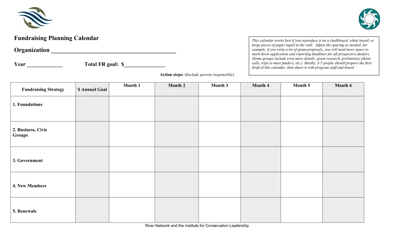
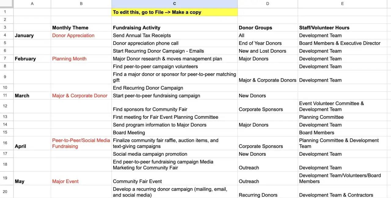
Some groups use this phrase to mean a one-month donation grid. Others mean a yearly planning sheet that maps campaigns, deadlines, and outreach. In practice, both versions solve the same problem: they stop fundraising from becoming reactive. I like them because they make the work visible. Everyone can see the goal, the deadline, and who is responsible for what.
That matters especially for schools, youth sports, rescues, church groups, and neighborhood projects, where the real challenge is usually not generosity but coordination. A calendar gives supporters a rhythm to follow and gives your team a shared reference point. In 2026, the campaigns that feel easiest are usually the ones that pair a simple calendar with a mobile payment path and a live progress update. Once that structure is clear, the next question is what the template itself should actually contain.
The pieces I would not leave out
If I were building this from scratch, I would treat the template like a working document, not just a graphic. Every part should answer a donor question before the donor has to ask it.
| Template field | What to include | Why it matters |
|---|---|---|
| Campaign goal | A dollar target and what it will fund | Gives the fundraiser a purpose, not just a number |
| Date range | A single month, a quarter, or a full annual schedule | Makes the timeline visible and creates urgency |
| Donation rule | Pick-a-date, sponsor-a-day, reverse calendar, or flat gift | Removes confusion about how much to give |
| Payment method | A clear way to pay on mobile or in person | Reduces drop-off at the final step |
| Progress tracker | Filled dates, total raised, or remaining slots | Creates momentum and social proof |
| Rules and limits | Whether donors can claim more than one date, hold a slot, or sponsor a bonus day | Prevents overlap and awkward handoffs |
| Thank-you plan | Who gets thanked, when, and how | Keeps the campaign relational instead of transactional |
That last row is easy to ignore, but I would not. If the thank-you process is built in from the start, the campaign feels more credible and much less improvised. Once those fields are set, the next decision is which calendar model actually fits your audience.
Which version fits your audience
Not every calendar fundraiser should look the same. The wrong model can make a good cause feel oddly complicated, and that is usually where donor energy leaks away.
| Format | How it works | Best for | Main tradeoff |
|---|---|---|---|
| Pick-a-date grid | Supporters claim a date and donate the amount tied to that day | Broad community groups that need low-friction giving | Top gift value is capped by the calendar itself |
| Reverse grid | Dates start at the highest amount and count down | Groups that want stronger early revenue | The first asks feel heavier |
| Sponsor-a-day | Each slot has a fixed price instead of a date-based amount | Teams that want simpler messaging and corporate sponsors | Less playful, less viral |
| Photo or printed calendar sale | Supporters buy a calendar product and the proceeds support the cause | Organizations with strong visuals and enough lead time for printing | Higher production and fulfillment effort |
A standard 1-to-31 pick-a-date month has a theoretical maximum of $496, because 1 + 2 + ... + 31 equals that amount. February tops out at $406 in a 28-day month, and $435 in a leap year. That makes the format excellent for accessible giving, but it also means it is rarely the right choice for a very large target unless you add sponsors or run multiple cycles. If your audience is price-sensitive, the pick-a-date version usually wins because people can contribute $4, $11, or $27 without feeling boxed in.
When the gift size needs to be more predictable, I lean toward a flat sponsor-a-day version or a hybrid with a few premium slots. That choice affects how you build the campaign next, because the setup changes as soon as the donation logic changes.
How I would build and launch it step by step
I prefer a short build process that keeps the team moving. The point is not to produce more planning; it is to produce a fundraiser people can actually follow.
- Set the target first. Decide how much money you need and what it pays for. A calendar without a real use case feels decorative.
- Choose the campaign window. One month is the most intuitive option, but a quarterly or annual calendar can work when your community needs a longer runway.
- Pick the donation logic. Use one model only. Too many choices make the ask feel messy.
- Build the public-facing tracker. Show claimed dates, remaining slots, or raised totals so people can see momentum.
- Make payment effortless. In practice, the fewer clicks the better. If someone has to hunt for instructions, you lose impulse donations.
- Recruit a small launch team. A handful of early donors can fill the first visible slots and make the campaign feel active.
- Schedule reminders before you need them. Launch day, halfway point, and final weekend are the moments that usually matter most.
If you want a practical benchmark, a single 31-day grid that raises $496 only gets you so far. Three full months of that model would bring in $1,488, which is close to a $1,500 target but still leaves a gap. That is why I like to plan sponsor support or bonus slots before launch instead of hoping the campaign will magically overperform. Once the build is in place, promotion becomes the next lever.
How to promote it without wearing people out
The best fundraising calendars do not depend on constant posting. They depend on a few clear messages repeated at the right moments. I usually think in waves:
- Launch wave. Explain the cause, the date range, the donation rule, and the deadline in one glance.
- Momentum wave. Share filled spots, thank donors publicly if they are comfortable with it, and show what is still open.
- Push wave. Make the remaining days feel urgent, not desperate. A final weekend reminder often does more than a week of scattered posts.
What works well is specificity. Instead of saying you are “raising funds for the community,” say what the money covers: supplies for a class trip, veterinary care for a rescue litter, or warm meals for a winter drive. Concrete outcomes make the calendar feel meaningful. I also think donors respond better when they can see their contribution in context, which is why a simple progress bar or filled-date grid matters so much. If the campaign stalls, the problem is often not your cause; it is friction in the message or the payment path.
Mistakes that quietly slow these fundraisers down
I see the same problems repeat across school, nonprofit, and community campaigns. None of them are dramatic, but they all create drag.
- The goal is vague. “Help us raise money” is weaker than “Help us fund 30 winter care packages by the end of the month.”
- The calendar is too busy. If the design looks clever but the donor cannot tell what to do, the campaign loses speed.
- There is no public progress. People are more willing to act when they can see other people already participating.
- Payment takes too many steps. Mobile donors especially will abandon a form if it feels clumsy.
- The team waits too long to follow up. A dead week rarely fixes itself.
- The ask is mismatched to the audience. A reverse grid can work beautifully for a committed donor base, but it is a poor fit when people need a softer entry point.
The way around most of these issues is not more design work. It is stronger structure. Once the template is clean and the ask is easy to understand, the campaign becomes much easier to reuse, which is where the template earns its keep.
A fill-in structure you can adapt fast
When I need a reusable version, I keep the copy sparse and direct. Here is the kind of structure I would start with for a one-month campaign:
| Section | Example content |
|---|---|
| Campaign name | One cause, one month, one clear outcome |
| Goal | Raise $1,500 for supplies, services, or event costs |
| Dates | June 1-30, August 1-31, or any single month that fits your schedule |
| How to give | Claim a date, donate that amount, and mark it as taken |
| Bonus option | Sponsor an unclaimed date or match the final weekend |
| Contact | One person who answers questions and updates the tracker |
| Closing line | Thank you for helping us turn a simple calendar into real community support |
If the campaign needs to feel more public-facing, I would add a note about who benefits and a visible count of claimed days. If it needs to feel more private or personal, I would simplify the wording and keep the distribution in a smaller group. The template should fit the relationship you already have with supporters, not force them into a format that feels foreign.
What I would check in the first 72 hours
The first three days tell you a lot. If the launch feels awkward, it usually means the ask is too complicated or too quiet. I check four things first: whether the first slots are moving, whether people can pay in one step, whether the campaign goal is visible without scrolling, and whether someone is actively answering questions. Those four details do more for conversion than a polished header image ever will.
If the response is slower than you expected, I would not overhaul the whole campaign immediately. I would tighten the copy, add one clear reminder, and create a visible reason to act now, such as a match, a sponsor challenge, or a deadline extension that is announced honestly rather than awkwardly hidden. The best version of this format feels simple, human, and easy to complete in under a minute, and that is the standard I would hold onto whenever I revise it.