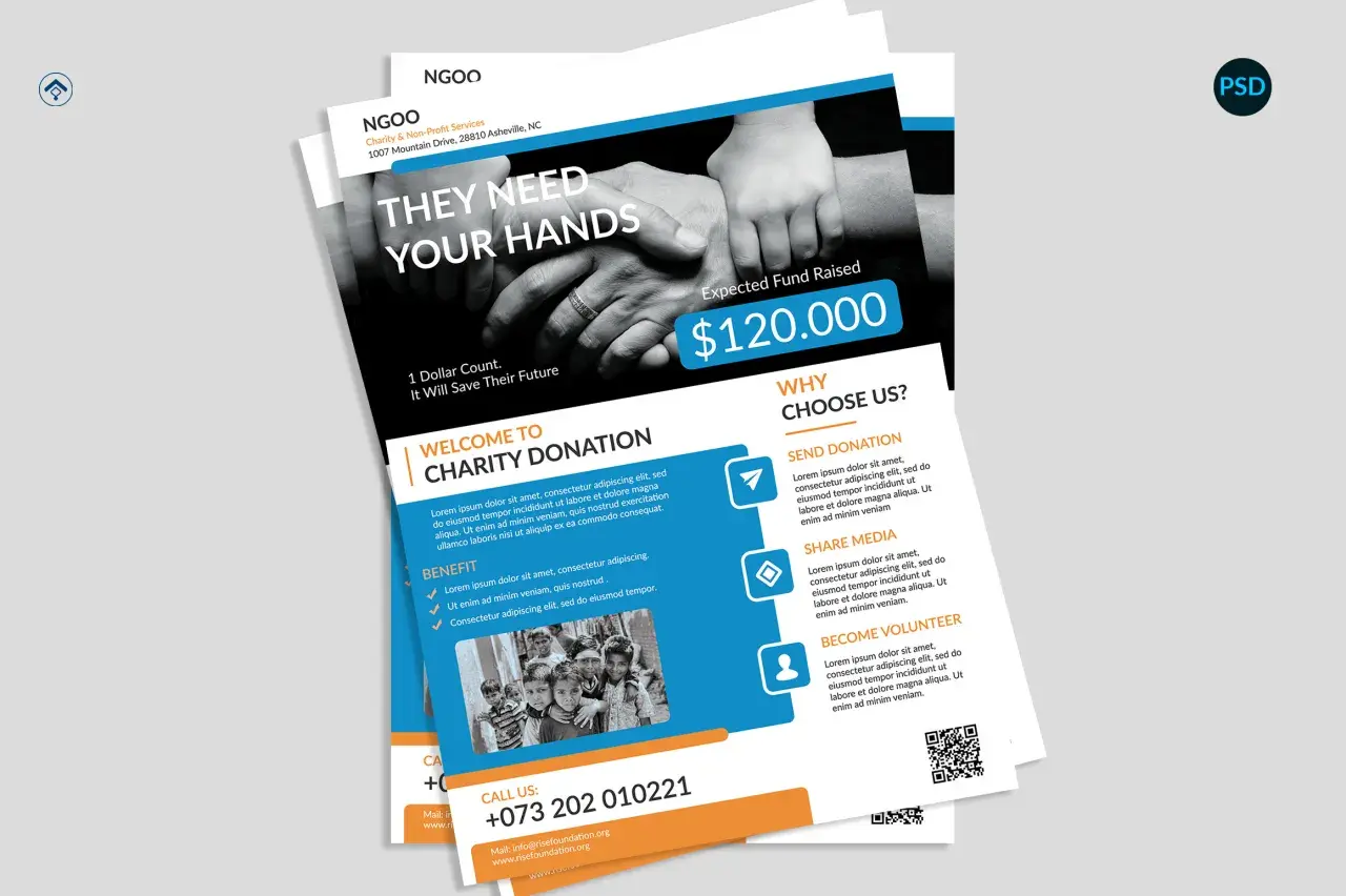
Strong fundraising graphics do more than decorate a campaign. They help a supporter understand the cause, feel the urgency, and see the impact of a gift before they ever reach the donation button. I usually think of them as the fastest part of the story: if the visual is unclear, the rest of the appeal has to work much harder. This article breaks down what makes a graphic effective, which elements belong in it, how to adapt it for different channels, and where campaigns commonly lose momentum.
What makes a campaign graphic work
- One clear message is better than a crowded layout with several competing ideas.
- The graphic should show the donor’s role, not just the organization’s need.
- Channel matters: email headers, feed posts, stories, and donation-page banners all need different crops and levels of detail.
- Accessibility is part of performance, so readable contrast and alt text are not optional extras.
- Progress updates, matching windows, and thank-you visuals are usually stronger than generic promo art.
What people actually need from a fundraising visual
In practice, the viewer is asking three questions at once: What is this for? Why should I care now? What should I do next? A good campaign visual answers those questions in a single glance. That is why strong art direction, concise copy, and a believable human scene usually beat a busy collage of icons, gradients, and stock photos.
For community and social good campaigns, the best visuals usually do four jobs at once: they signal the mission, show a real or believable beneficiary context, make the urgency visible, and point to one action. If any of those pieces is missing, the graphic may still look polished, but it will convert less reliably. Once I frame the job this way, the design choices become much easier.
In the United States, that matters especially during Giving Tuesday, year-end appeals, emergency response, and matching-gift windows, when donors are scanning quickly and comparing several requests at once. The visual has to carry weight fast. That is the standard I use before I think about color, layout, or type.
The next step is deciding which ingredients deserve space on the page and which ones should stay out of the way.
The core pieces that belong in almost every asset
I build most campaign visuals around a small set of ingredients. When those pieces are clear, the design feels intentional instead of decorative.
| Element | What it should do | What weak versions do |
|---|---|---|
| Headline | State the ask or the moment in plain language, ideally in 6 to 10 words. | Hide the point behind vague phrases like “Join us” or “Help make a difference.” |
| Image or illustration | Show the human context, the program in action, or the result of giving. | Use generic stock imagery that could belong to any nonprofit. |
| Proof point | Give one specific number, milestone, or outcome so the appeal feels real. | Lean on broad claims without evidence. |
| Call to action | Tell the viewer exactly what to do next, such as donate, share, register, or match. | Leave the audience to guess the next step. |
| Brand cues | Use consistent colors, logo placement, and typography so the asset feels trusted. | Change the look so much that the campaign feels disconnected from the organization. |
| Accessibility cues | Keep text readable, preserve contrast, and make sure the image can be understood in alt text. | Put essential information only inside the image and make it hard to access elsewhere. |
The biggest mistake I see is overloading the graphic with every possible message. If the layout is trying to explain the mission, the budget gap, the event details, the donor match, and the thank-you all at once, nothing lands. One image, one idea, one next step is still the safest rule I know. The next question is where each version of that structure should live.
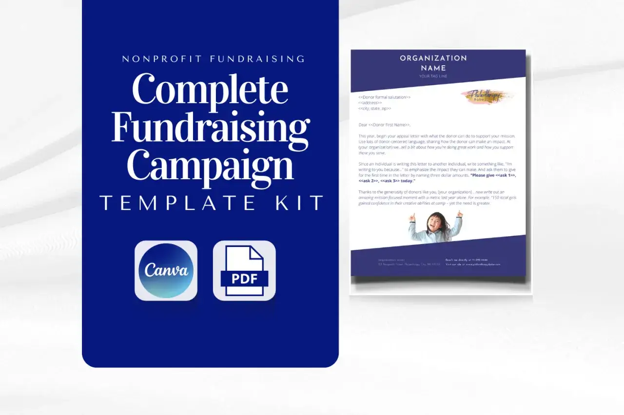
Choose the right format for each channel
The same visual idea does not perform equally well everywhere. A post that feels sharp in an Instagram feed can collapse inside an email header, and a donation-page banner can look empty if it is cropped for a story format. I use channel-specific versions because the screen, the attention span, and the level of detail all change.
| Channel | Best-fit format | Practical default | What I avoid |
|---|---|---|---|
| Instagram feed | Impact stat, quote card, launch post, or single-photo appeal | 1080 x 1350 px for vertical posts, or 1080 x 1080 px for simple layouts | Dense paragraphs, tiny logos, and important text near the edges |
| Instagram Stories and Reels | Countdown, milestone update, matching-gift reminder, or quick ask | 1080 x 1920 px | Fine print, wide layouts, and too many small visual elements |
| Facebook feed | Campaign announcement, event push, or donation reminder | 1080 x 566 px for landscape or 1080 x 1359 px for vertical | Overcrowded compositions that lose clarity in mobile cropping |
| Email header | Clean hero image that sets the tone before the reader hits the body copy | About 600 px wide and under 300 px tall | Busy banners with multiple messages competing for attention |
| Donation page banner | Mission image, progress cue, or focused campaign opener | 1600 x 400 to 600 px | Text-heavy collage layouts that distract from the donation form |
Givebutter’s 2026 guide uses those kinds of practical defaults, and I think that approach is sensible: build for the real crop, not the ideal one. My rule is simple. If the graphic still makes sense when viewed on a phone with one thumb on the screen, it is probably ready. If it only looks good on a desktop mockup, it needs another pass. The next step is turning that channel logic into a repeatable workflow.
A workflow that keeps the message sharp
When I build a campaign set, I start with the ask, then the proof, then the visual. A simple static asset usually takes me 30 to 60 minutes once the copy is approved; a multi-format kit takes longer because resizing and testing eat time. That extra effort is worth it, because the same idea has to survive in several placements without losing clarity.
- Write one sentence that states the action you want.
- Choose one proof point, such as a dollar goal, a deadline, or one human detail.
- Pick one visual focal point, ideally a real photo, a strong illustration, or a clean progress indicator.
- Draft the overlay copy with short line breaks and only the words that matter.
- Create variants for feed, story, email, and donation-page use before you publish anything.
- Test the graphic on a phone, check the crop, and make sure the contrast still holds.
I also like to make one version that feels urgent and one that feels steady. A matching-gift graphic, for example, can lean on deadline pressure, while a year-round donor appeal can feel more relational and less immediate. The message changes slightly, but the structure stays the same. That discipline is what keeps a campaign from feeling random, and it leads directly to the mistakes that quietly undercut results.
Mistakes that quietly lower donations
The weakest campaign visuals rarely fail because the design is ugly. They fail because the message is blurred or the user experience is awkward.
- Too much copy makes the graphic harder to scan, especially on mobile.
- Generic stock imagery removes specificity and can make the campaign feel interchangeable.
- No deadline or milestone weakens urgency, even when the campaign itself has a clear end date.
- Weak contrast makes the message harder to read and often kills the call to action.
- No mobile check means the final file may hide the most important detail in a crop.
- No thank-you version misses the chance to reinforce generosity after the donation is made.
I have seen well-designed campaigns underperform simply because the graphic tried to say too much. I have also seen modest visuals outperform polished ones because they were specific, readable, and tied to a clear moment. The lesson is not to overdesign; it is to remove friction. That includes the accessibility layer, which is not separate from performance.
Accessibility and trust are part of the design
I treat accessibility as a conversion issue, not just a compliance issue. If a supporter cannot read the text, understand the image, or follow the next step, the visual is not doing its job. W3C’s WCAG standard sets a contrast ratio of at least 4.5:1 for normal text and 3:1 for large text, and that baseline is useful because it keeps campaign copy readable under real-world conditions.
My minimum checklist is straightforward:
- Keep text contrast strong enough to read on a phone in daylight.
- Use alt text that explains the purpose of the image, not every visual detail.
- Avoid using color alone to communicate meaning, such as red for danger or green for success without labels.
- Keep key dates, dollar goals, and calls to action in live text somewhere outside the image when possible.
- Add captions or transcripts if the asset includes motion or video.
Trust also comes from restraint. If the graphic looks clean, the message is honest, and the action is obvious, the supporter does not have to work to understand what is being asked. That is especially important for community-driven campaigns, where credibility is often built in small moments rather than through one dramatic pitch. Once accessibility is in place, the final advantage is having a small reusable system that can carry the whole campaign.
The four visuals I would build first for a new campaign
If I had to keep the asset list small, I would start with four pieces. They cover the full campaign arc and can be reused across email, social, and landing pages with small copy changes.
- Launch graphic to announce the campaign and make the mission instantly understandable.
- Progress update to show momentum, usually with a percentage, a milestone, or a thermometer-style cue.
- Match or deadline graphic to create urgency when the campaign has a sponsor match or a closing window.
- Thank-you graphic to close the loop, recognize supporters, and set up the next ask.
That set is simple, but it covers the moments that matter most: start, momentum, urgency, and closure. When those pieces are consistent, the campaign feels organized even if the team behind it is small. That is the real value of good fundraising visuals: they make the mission easier to understand, and they make the act of giving feel like a clear next step instead of a leap.