A well-built PayPal donation form does one job: it lets a supporter give quickly, on mobile, without wondering whether the gift will be confirmed, recurring, or routed into the right nonprofit system. I focus on the parts that matter in practice: setup requirements in the United States, the difference between a direct donate button and PayPal Giving Fund, how recurring gifts work, and the small design choices that raise completion rates. For a nonprofit, the goal is not just to accept a payment; it is to create a donation flow that is simple to trust and easy to maintain.
Key facts to keep in mind before you launch
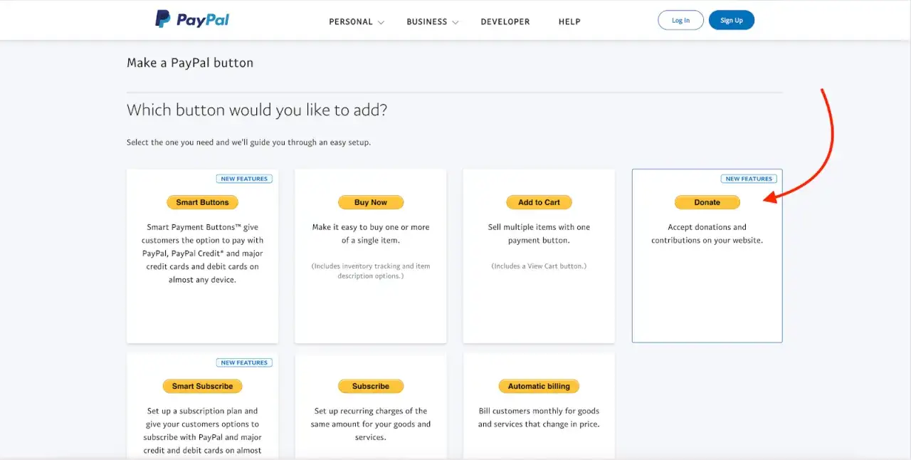
- A direct donate button is the fastest way to accept gifts on your site and can support monthly donations.
- Verified U.S. charities can qualify for reduced processing costs; PayPal currently advertises a registered charity rate of 1.99% + fixed fee.
- PayPal Giving Fund removes fees for charities and donors, but eligible funds are granted monthly and enrollment rules apply.
- The strongest donation pages keep fields short, mobile-friendly, and clear about recurring giving.
- If your nonprofit software cannot map gift source, amount, and frequency cleanly, fix that before launch.
What this donation flow needs to do for a nonprofit
When I look at a donation page, I think in terms of friction. Every extra field, unclear label, or jump to another screen gives the donor one more reason to stop. PayPal helps because the payment handoff is familiar and, on the standard donate path, donors complete the gift on PayPal's site, which reduces the burden on your nonprofit and gives supporters a checkout flow they already recognize.
The important part is matching the tool to the fundraising job. A small community group usually needs speed and clarity. A mature charity may need recurring gifts, campaign attribution, and software that can reconcile donations cleanly. That is why I treat the donation form as part payment tool, part donor-experience layer, and part operations system.
Before you choose the layout, I would get the account side right first, because that is what keeps the rest of the setup from turning messy later.
The setup path that works for U.S. charities
For U.S. nonprofits, the cleanest path starts with a business account created by an authorized representative. Select the nonprofit organization type, add the EIN, and be ready to provide IRS documentation if PayPal asks for it. You will also need to verify the primary user’s identity and link the nonprofit bank account before you can rely on the account for fundraising.
- Create or upgrade to a PayPal business account.
- Select nonprofit organization as the business type.
- Enter the EIN and any requested charity documentation.
- Complete identity verification for the authorized user.
- Link the nonprofit bank account.
- Add the donate button or checkout flow to the site and test it on mobile.
For PayPal Giving Fund, the process is a little different: once the charity account is confirmed, review is typically completed within 2 business days, and most eligible charities are enrolled automatically within 3 business days. California charities should expect an extra enrollment form. In other words, the technical setup is straightforward, but the verification path is where most teams lose time if they are not organized upfront.
That verification step matters because confirmed charities can unlock reduced processing rates, while unverified accounts miss the better economics. If you are planning a launch around a campaign deadline, I would start verification earlier than you think you need it.
Which PayPal option fits your fundraising model
I usually compare three paths: the standard donate button, recurring billing through PayPal Checkout or Website Payments Pro, and PayPal Giving Fund. They solve different problems, and choosing the wrong one creates avoidable admin later.
| Option | Best for | Strengths | Trade-offs |
|---|---|---|---|
| Donate button on your website | Most nonprofits that want a quick launch and a familiar donor experience | No monthly or setup fees for donation button payments, mobile-optimized, recurring monthly giving can be enabled, donors finish on PayPal | Processing fees still apply, and your team still needs to manage verification and reconciliation |
| Recurring billing with PayPal Checkout or Website Payments Pro | Organizations with a developer and a more custom giving flow | Supports more tailored recurring logic and can accept different payment types depending on setup | Requires API-level work, so it is not the fastest path for a small team |
| PayPal Giving Fund | Charities that want wider visibility and lower admin overhead | No fees to charities or donors, automatic donor receipts, visibility across partner platforms, monthly grants to the charity account | Eligibility rules apply and you give up some control over the checkout journey |
The direct donate button is the best default for most nonprofits because it is simple, mobile-friendly, and can support monthly donations without turning the project into a custom build. A custom recurring setup makes sense when you need deeper control and have a developer available. PayPal Giving Fund is the lightest on fees and admin, but I would treat it as a distribution network with monthly grants rather than a fully controlled checkout experience.
If your priority is low friction on your own site, start with the donate button. If your priority is reach and fee minimization, evaluate Giving Fund. If your priority is custom logic, then recurring billing becomes a software project, not just a form choice.
How I would design the form for higher completion rates
My rule is simple: ask only for what you truly need before the donor gives. Amount, frequency, email, and designation usually cover most nonprofit use cases. Anything beyond that should be earned, not assumed. If the payment happens on PayPal's side, the page on your site should do the least amount of work possible and make the gift feel obvious.
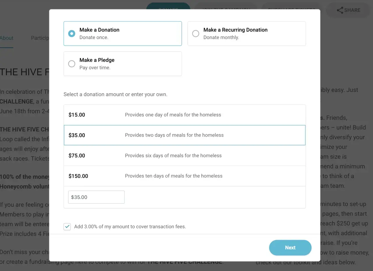
- Offer three suggested amounts and one custom field so donors can make a decision quickly.
- Make the monthly option visible, but do not hide the one-time gift behind it.
- Use a short impact line that explains what each amount helps fund.
- Keep the page mobile-first, because the donate button is already optimized for small screens.
- Show a clear confirmation message and a next step after the gift is submitted.
The strongest donation pages usually feel calm, not persuasive in an aggressive way. I want the donor to know where the money goes, how recurring gifts work, and what happens after clicking donate. That combination tends to do more for conversion than flashy design ever will.
Once the page is set up cleanly, the next risk is not design. It is the small operational mistakes that quietly erode trust and reporting accuracy.
Common mistakes that quietly reduce donations
The worst problems are rarely technical failures. They are small, cumulative decisions that make giving feel harder than it should.
- Asking for too many fields before the donor sees the amount.
- Making recurring giving hard to find or impossible to understand.
- Launching before the charity account, bank link, and nonprofit verification are complete.
- Ignoring the fee structure, then discovering finance and development interpret the gift differently.
- Skipping mobile testing and assuming desktop behavior will match.
- Leaving the thank-you flow disconnected from the CRM or email platform.
One mistake I see often is treating the form as finished when the payment succeeds. For a nonprofit, the real work starts after the transaction: stewardship, receipting, accounting, and campaign reporting all depend on the data that leaves the form. If that handoff is weak, the donation may still clear, but the operation around it becomes noisy fast.
That is where nonprofit software starts to matter as much as the checkout itself, because the donation page should feed the rest of the system instead of creating cleanup work.
What to check in your nonprofit software before launch
If you already use donor management software, the donation form should fit into that system instead of sitting beside it. I would check four things first: whether gifts flow into the CRM with the right source label, whether recurring donations are easy to identify, whether finance can reconcile fees cleanly, and whether staff can update donation copy without waiting on a developer.
In practice, the best setup is the one that preserves clean data. Campaign source, one-time or monthly status, gross amount, fees, and net deposit should all be easy to trace. If your software stack cannot do that, the page may still collect gifts, but you will lose time fixing reports later. That is a bad trade for a nonprofit, because time spent reconciling is time not spent fundraising or stewarding donors.
For smaller organizations, I would keep the stack lean and use PayPal as the payment rail. For larger teams, I would ask whether the nonprofit software can handle segmentation, automated thank-you messages, and donor history without manual exports. The right answer is usually the one that reduces daily admin, not the one with the longest feature list.
The cleanest rollout is rarely the most elaborate one. It is the one that keeps the first donation, the second donation, and the monthly recurring gift equally easy to manage.
A lean way to launch without creating more admin
If I were launching this from scratch, I would keep the first version boring on purpose: verified charity account, one clear donate page, a visible monthly option, and a CRM that captures every gift cleanly. Then I would test the flow on a phone, confirm the thank-you message, and make sure finance knows exactly where to find fees and deposits.
After launch, I would watch three signals for 30 days: completion rate, monthly-gift adoption, and how often staff need to repair records manually. If those three stay healthy, the form is doing its job. If one of them slips, I would fix the donation page before adding more fundraising complexity.
A good donation experience should feel like a direct handoff from intent to impact. When the page is short, the options are clear, and the nonprofit software behind it is well mapped, the form becomes almost invisible in the best possible way.