
A good volunteer sign-up sheet does one job well: it helps people commit quickly without making the process feel like paperwork. In this article I break down what to include in a free volunteer sign-up sheet template, how to keep it useful for schools, nonprofits, churches, and neighborhood projects, and when a simple paper sheet is enough. I also cover the most common mistakes that slow sign-ups down, especially when the form is too long or the roles are too vague.
Key details to include in a volunteer sheet people will actually finish
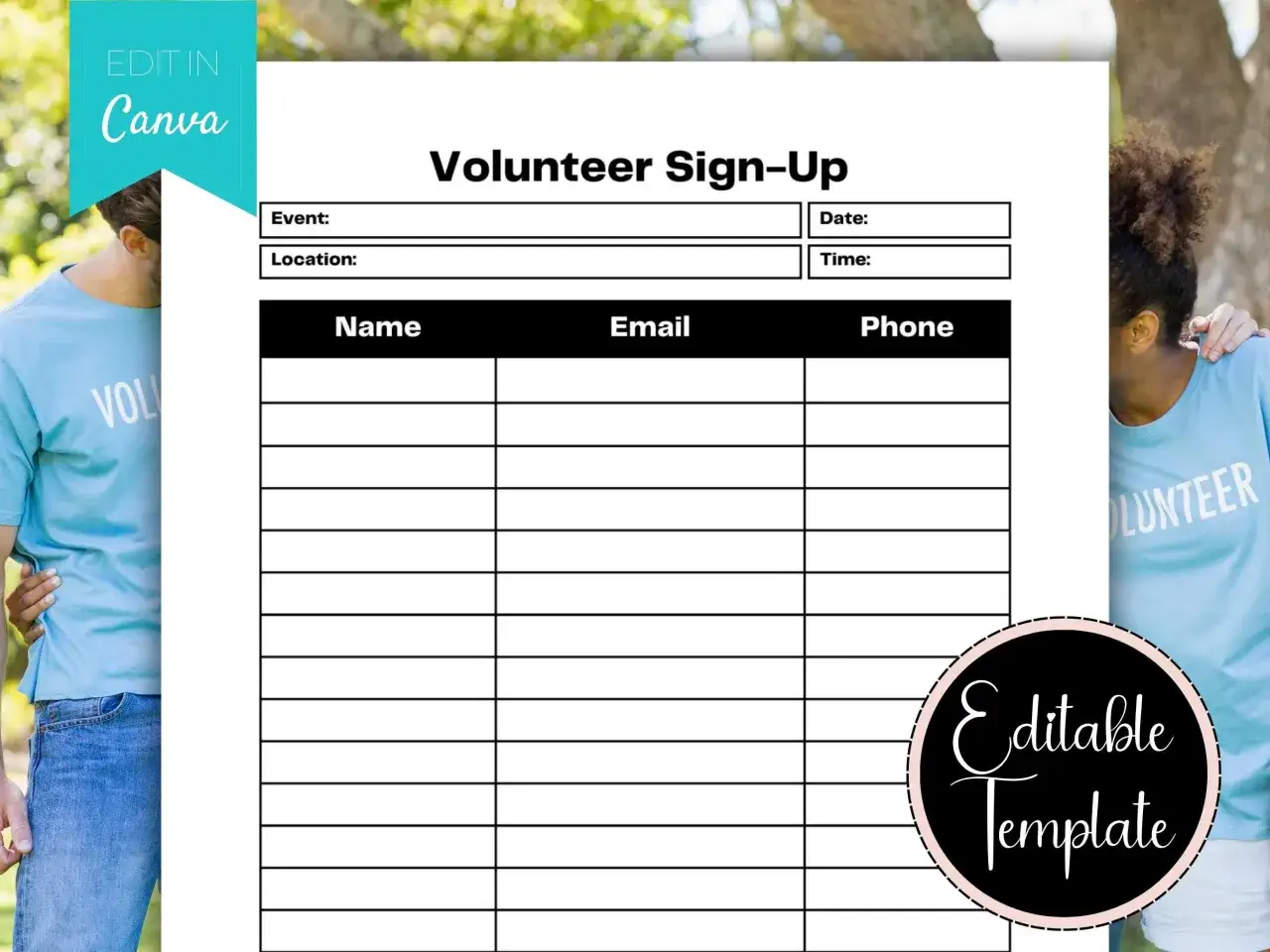
- Start with the event basics. Name, date, location, and shift time should be visible before any volunteer details.
- Collect only what you will use. Contact info, availability, and role preference are usually enough for a first pass.
- Add extras only when they matter. Skills, certifications, emergency contact, or access needs should serve a real purpose.
- Keep the form short on purpose. A lightweight sheet gets more completions than a questionnaire that feels like onboarding.
- Choose the format around the event. Paper works for in-person, one-day sign-ups; online forms work better when schedules change.
What this sheet should do
I think of a volunteer sign-up sheet as a lightweight registration form, not a full application. Its job is to match a willing person with a real task, capture enough contact detail to follow up, and make the commitment clear before anyone signs up.
That distinction matters. A food drive, cleanup day, school fair, or church outreach project usually needs fast decisions and simple logistics. If you ask for too much up front, people hesitate; if you ask for too little, you spend more time chasing confirmations and fixing scheduling mistakes later.
For that reason, I build the first version around the question every volunteer actually has in mind: what am I doing, when am I doing it, and who will reach me if plans change? Once that line is clear, the template itself becomes much easier to design.
A copy-ready layout you can reuse in minutes
If you want a practical template, start with a clean one-page layout and keep the language plain. I usually recommend making the event details visible at the top, then placing the sign-up fields underneath in a simple table or form section.
| Field | Why it belongs | Use it when |
|---|---|---|
| Event or project name | Shows people exactly what they are joining. | Always. |
| Date and shift time | Prevents confusion about the actual commitment. | Always. |
| Location | Helps volunteers decide quickly and reduces last-minute questions. | Always. |
| Full name | Gives you a clear record of who signed up. | Always. |
| Email address | Makes confirmation and reminders simple. | When you need follow-up after sign-up. |
| Phone number | Useful for day-of changes or urgent coordination. | When timing may shift or the role is time-sensitive. |
| Preferred role or task | Helps you place people where they are most useful. | When the event has more than one station or duty. |
| Availability | Shows which shifts or days a person can actually cover. | For recurring events or multi-shift programs. |
| Skills or experience | Useful for roles that need a specific ability, such as setup, translation, first aid, or outreach. | When the work is not interchangeable. |
| Emergency contact | Creates a backup point of contact for larger or physical events. | For outdoor, youth, or higher-risk activities. |
| Notes or access needs | Lets volunteers flag mobility, schedule, or communication needs. | When inclusion and logistics matter. |
If I were turning this into a printable sheet, I would keep the title big, the instructions short, and the spacing generous enough that people can complete it at a table without feeling rushed. The next question is which of those fields are essential and which are just clutter.
Which fields belong in the form and which ones do not
Not every volunteer sheet should look the same. The right questions depend on whether you are filling a few one-off slots or building a pool of people for repeated work.
Keep these fields
- Name and a reliable contact method.
- Date, time, and location of the shift or event.
- Role choice, task preference, or area of interest.
- A short note about what the volunteer should expect to do.
Add only when there is a reason
- Emergency contact, when the event is outdoors, physical, or runs for many hours.
- Skills or certifications, when the role actually depends on them.
- T-shirt size, meal preference, or transportation needs, when those details affect planning.
- Company or group name, when corporate teams or school groups may sign up together.
Read Also: Free Online Community Service - Make a Real Impact
Leave these off by default
- Home address, unless you need it for mailing or transport.
- Date of birth, unless age eligibility matters for the role.
- Any health detail that is not truly necessary for the assignment.
In the United States, I would be especially cautious about collecting anything sensitive unless it directly affects the volunteer experience or safety. Once the content is lean and relevant, the form becomes much easier to finish without friction.
How to make volunteers finish the form
The best volunteer forms feel almost self-explanatory. I try to make each step obvious enough that someone can complete it in one pass, even on a phone.
- Put the commitment first. Show the date, time, and task before the sign-up fields so nobody has to guess what they are joining.
- Use checkboxes where possible. Checkboxes make role selection and availability faster than open text boxes.
- Write short labels. “Preferred shift” is better than a long sentence that repeats the instructions.
- Keep required fields to a minimum. I usually make name and contact info required, then leave everything else optional unless the event truly needs it.
- Tell people what happens next. A single line such as “We will email you within 24 hours” reduces uncertainty and boosts completion.
- Test it on a phone. If the form is awkward on a small screen, it will lose volunteers before they reach the final field.
The goal is not just to collect information. It is to make the act of helping feel simple, respectful, and immediate. That choice matters because the best format depends on how people will sign up.
Paper sheet or online form
I still see paper sheets work well at registration tables, community fairs, and one-day volunteer events. But when sign-ups happen over several days or involve rotating shifts, an online form usually saves more time than it costs.| Format | Best for | What to watch |
|---|---|---|
| Paper sheet | In-person sign-ups, small events, and places with limited tech access. | Handwriting can be hard to read, updates are manual, and reminders take extra effort. |
| Online form | Recurring roles, shift selection, and events where you need quick confirmations. | You need a device-friendly layout and a clear follow-up message. |
My rule of thumb is simple. If the sheet will live on a clipboard for one afternoon, paper is fine. If you expect people to return later, choose between multiple shifts, or update details after they sign up, a digital form is the stronger option. Either way, the structure should still be short enough that people can complete it in a minute or two.
Common mistakes that make good volunteers stop halfway
I see the same problems over and over: the form is technically correct, but it feels like work. That is usually enough to lower response rates, especially for community groups that depend on goodwill rather than formal recruitment.
- Vague roles. “Help out” sounds friendly, but it does not tell people what they will actually do.
- No time commitment. Volunteers want to know whether they are giving one hour or three.
- Too many open-ended questions. Long text fields slow people down and make the form feel heavier than it is.
- Missing follow-up details. If people do not know who will contact them, they are less likely to trust the process.
- Collecting unnecessary personal data. A short form builds more confidence than a form that asks for information you never use.
- Ignoring accessibility. Small text, cluttered spacing, and poor contrast create avoidable friction.
When I edit a volunteer sheet, I usually cut first and add second. Removing one unnecessary field often improves the form more than polishing the wording of five others. With those mistakes out of the way, the final structure gets much simpler.
The simplest structure I trust for most community groups
If I were building a form for a neighborhood cleanup, food drive, or school event, I would start with one of three structures:
- One-time event sheet. Keep it to name, contact, shift, role, and one short note field.
- Recurring shift sheet. Add availability, preferred day, and a simple reminder consent line.
- Skills-based interest form. Add experience, certifications, and a place to indicate how the volunteer wants to help.