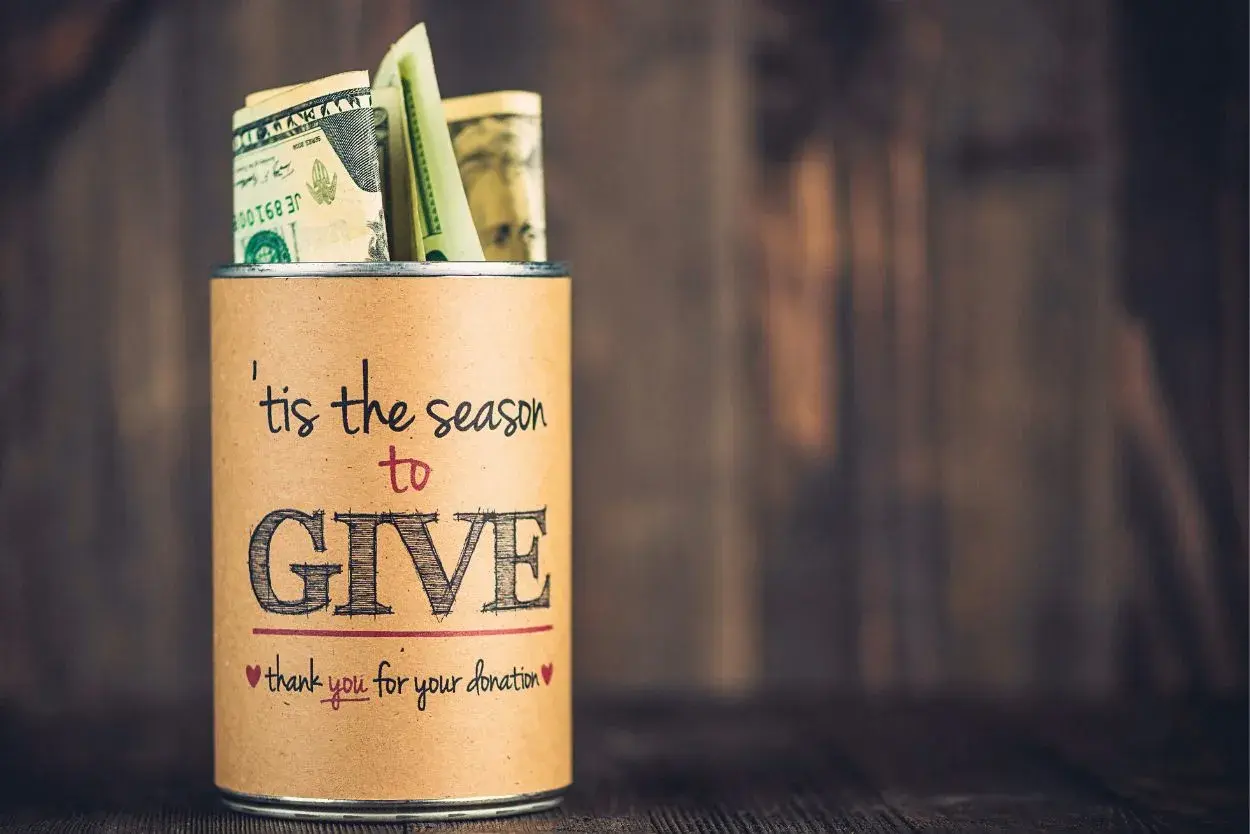
Fundraising signs do three jobs at once: they catch attention, explain the cause, and make the next step obvious in a few seconds. The best fundraising sign ideas are not just decorative; they are built for speed, distance, and trust, whether you are promoting a school car wash, a neighborhood food drive, or a nonprofit event. In this article, I break down the sign concepts that actually work, the wording that gets read, and the design choices that make a campaign feel clear rather than cluttered.
The signs that work best are simple, visible, and tied to one action
- One message wins. A sign should usually ask for one thing, not three.
- Readability beats decoration. If people cannot read it from the expected distance, the design fails.
- Specificity builds trust. Naming the cause, date, amount, or beneficiary makes people more likely to respond.
- QR codes help when the handoff is clear. They work best when paired with a short, obvious call to action.
- Placement changes everything. A great sign in the wrong spot will still underperform.
The first job is clarity, not decoration
I usually start by treating a fundraising sign as a tiny decision funnel: first it earns attention, then it earns understanding, and only after that does it earn action. That means the main headline has to answer three questions fast: what is this for, who is it helping, and what should I do next?
A practical rule of thumb is to size letters for distance, not for the layout mockup. One inch of letter height per 10 feet of viewing distance is a useful baseline for outdoor signs, and I design even more conservatively when traffic is moving. For a sign people read while walking past, I aim for 5 to 8 words. For a roadside sign, I often want 3 to 6 words plus a very clear visual cue.
That also changes the tone. Emotional copy works when people have time to stop and absorb a story. Functional copy works when they only have a moment. If the sign has to do both, the headline should stay functional and the supporting detail should move lower on the design, where slower readers can find it. Once that basic structure is clear, the next step is choosing the right sign concept for the campaign.
Real sign concepts for different fundraising settings
The strongest signs usually match the event, the audience, and the amount of time people have to read. A car wash sign should feel almost different from a donor wall or a school spirit banner, because the viewing conditions are different. I think that is where a lot of campaigns go wrong: they use one visual style everywhere and expect it to do a job it was never designed to do.
| Setting | Best sign concept | Sample copy | Why it works |
|---|---|---|---|
| School car wash | Bright poster board or yard sign with an arrow and price bubble | Car Wash Today Donation Supported |
Drivers need instant recognition, so the sign has to read like a traffic cue, not a flyer. |
| Booster club or team fundraiser | Team-color banner with a goal tracker | Help Us Reach Our Goal | A visible progress graphic creates momentum and makes the campaign feel shared. |
| Food or supply drive | Checklist-style sign with the exact items needed | We Need Canned Soup, Pasta, and Rice | Specific requests reduce hesitation because donors know exactly what to bring. |
| Community walk or 5K | Directional signs, sponsor boards, and a finish-line banner | Registration This Way | The sign is doing navigation work, not just promotion, so clarity matters more than style. |
| Church or nonprofit donation appeal | Photo-led poster with one strong call to action | Scan to Give | A human image plus a clear action helps bridge emotion and response. |
| Neighborhood or storefront campaign | Window cling, sidewalk A-frame, or coroplast yard sign | Support Local Students | These formats work well where people slow down and can read a bit more. |
If I had to narrow this down further, I would say there are four high-performing sign types: the attention sign for passing traffic, the directional sign for guiding movement, the trust sign for showing a goal or sponsor support, and the action sign for telling people how to donate. When a campaign uses those roles intentionally, the whole event feels more organized and more credible. With the concept chosen, the copy itself becomes the part that either converts or loses the moment.
How to write copy people actually remember
I try to keep fundraising copy short enough that it can be processed in one breath. That does not mean it has to be dull. It means every word has to earn its place. The most reliable formula is simple: what is happening, who it helps, and what the reader should do next.
Here are the copy patterns I use most often:
- Verb first. “Donate today” is stronger than a vague phrase like “Support our mission.”
- Specific beneficiary. “Help our marching band travel” feels more concrete than “Help the team.”
- Clear amount or item. “$10 feeds one student lunch” or “Bring paper towels” removes guesswork.
- Short action line. “Scan to give,” “Text to donate,” or “Drop off here” tells people exactly what happens next.
- Deadline if there is one. “By Friday” or “This weekend only” can add urgency without sounding pushy.
A few examples make the difference clearer:
- “Car Wash Today” works because it is direct and immediate.
- “Help the Class of 2026 Reach Its Goal” works because it names the group and the purpose.
- “Need 50 Cans by Sunday” works because it turns a general plea into a measurable target.
- “Scan to Sponsor a Family Meal” works because the action and impact are both visible.
Humor can help, especially for school events and informal community drives, but I would never let a joke hide the point of the sign. If people have to decode the punch line before they understand the ask, the sign is trying too hard. Once the message is right, the next factor is whether the material and placement can support it.
Materials and placement that change performance
The same message can perform very differently depending on what it is printed on and where it is placed. A sign for a one-day parking-lot event does not need the same durability as a banner that will hang across a fence for three weeks. I choose the material based on how much weather, handling, and repetition the sign will face.
| Material | Best use | Typical strengths | Limits |
|---|---|---|---|
| Poster board or foam board | Indoor events, same-day fundraisers, volunteer-held signs | Cheap, fast, easy to customize by hand | Poor weather resistance and limited durability |
| Coroplast yard sign | Lawns, roadside asks, school pickup zones | Lightweight, weather-resistant, good for repeated display | Works best with short copy and simple graphics |
| Vinyl banner | Fences, gyms, stage backdrops, longer campaigns | Large visual impact and strong reuse value | Needs proper mounting and can look busy if overcrowded |
| A-frame or sidewalk sign | Foot traffic near entrances, cafeterias, church doors, pop-up events | Easy to reposition and update | Smaller viewing distance means copy must stay very tight |
| Window cling or decal | Storefronts, school windows, donation centers | Clean, polished, good for recurring community messaging | Less effective if the window already has visual clutter |
Placement matters just as much. Put the primary message where people naturally slow down: the entrance, the turn-in point, the check-in table, the stop sign near the school, or the sidewalk bottleneck. For a moving audience, angle the sign toward the approach path, not toward the event staff who already know what it says. If the design includes a QR code, keep it close to the call to action and large enough that nobody has to step back to scan it.
I also like to think about contrast before color. A bold message on a matte background usually beats a busy design with five colors and a decorative font. If the weather or lighting is unpredictable, simplification helps more than cleverness. Even the best material choice can fail if the sign is cluttered, which is why the usual mistakes deserve their own attention.
Mistakes that quietly weaken a fundraiser sign
Most weak signs do not fail because the cause is bad. They fail because the viewer cannot quickly tell what matters. The problem is usually one of these:
- Too much text. People will not read a paragraph from the street.
- Weak contrast. Light gray on white, or dark text over a busy photo, kills readability.
- No action step. A sign that only says “Support us” leaves too much work to the reader.
- Logo overload. Branding matters, but it should not be larger than the actual ask.
- QR code without context. People need to know what happens after they scan.
- Generic wording. “Help the cause” is weaker than a sign that names the exact need.
- Wrong kind of humor. A playful line can help, but not if it makes the cause less clear.
One mistake I see often is a sign that tries to be both a brand piece and a donation ask and ends up doing neither well. Another is overdesigning for social media rather than the sidewalk or road where the sign actually lives. A small progress meter, donor count, or sponsor strip can be more persuasive than another graphic flourish because it gives people a visible sense of momentum. That leads naturally to the final decision: which sign system is the right one for the campaign you are running.
The simplest way to choose the right sign for your campaign
If I were choosing from scratch, I would match the sign to the audience’s pace. Fast traffic gets a bold roadside sign with very short copy. Slow foot traffic can handle a little more story, a QR code, or a sponsor list. Reusable campaigns deserve durable materials, while one-off events can lean into speed and low cost.
- For moving cars: use one headline, one arrow, and one action.
- For walk-up traffic: use a larger message, a photo, and a scan option.
- For recurring drives: invest in coroplast or vinyl so the sign can be reused.
- For community pride campaigns: add a goal tracker, donor wall, or school colors to build participation.
That is the frame I come back to most often: what can the passerby understand in 2 seconds, what can they feel in 5, and what can they do in 10. If those three answers are clear, the sign is doing real fundraising work instead of just occupying space.