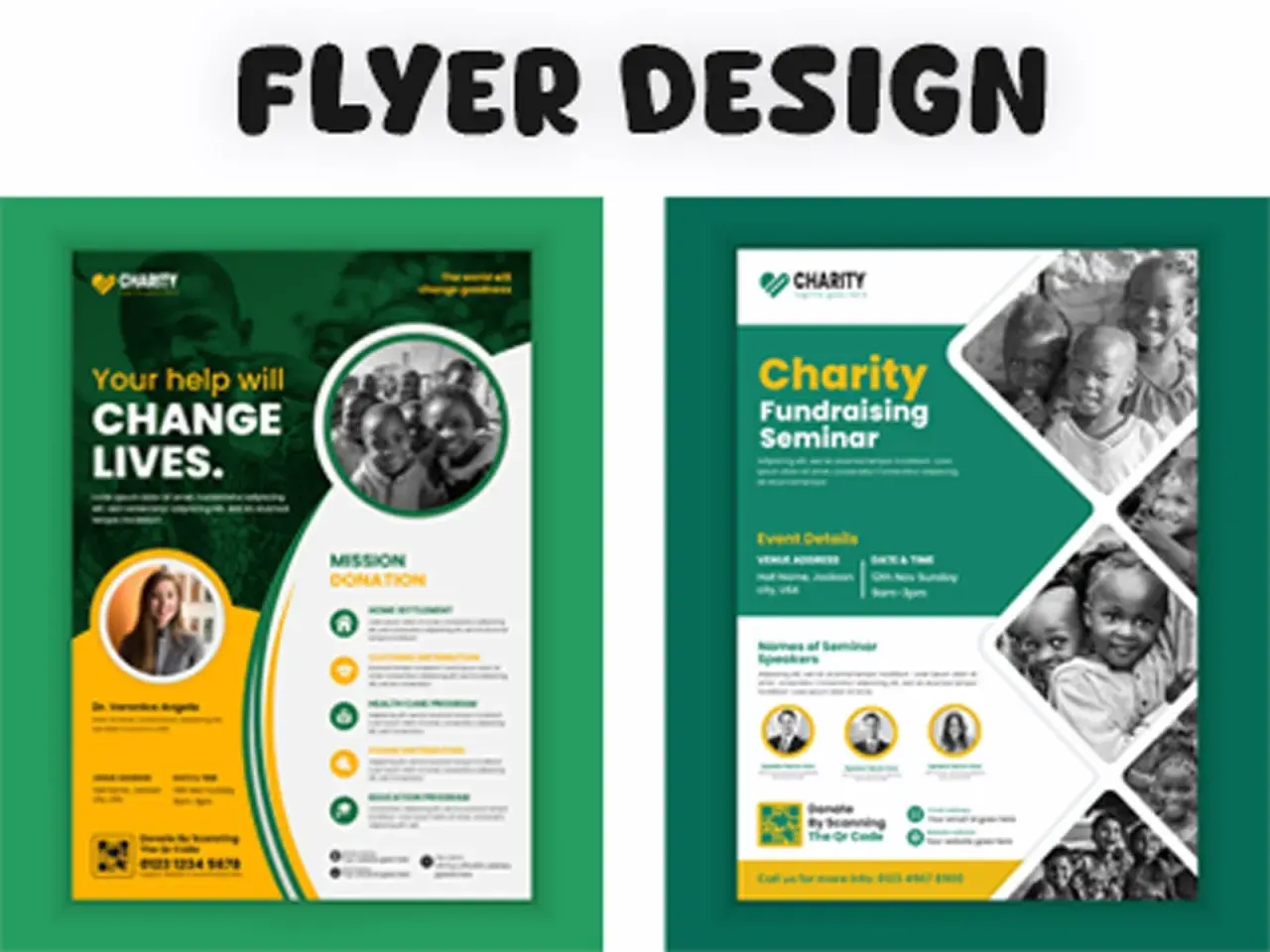
A strong fundraiser flyer does three jobs at once: it explains the cause, makes the event feel credible, and gives people a fast way to act. When it works, the page feels simple, specific, and worth sharing. When it fails, it usually fails because the message is vague, the ask is buried, or the design makes people work too hard.
What the page has to accomplish
- It should explain the cause in a few seconds, not after a long read.
- It needs one clear next step, such as donate, attend, volunteer, or RSVP.
- The strongest versions pair a human story with one concrete fact or number.
- Readability matters more than decoration, especially for print and mobile sharing.
- Print and digital versions should be adapted for the way people will actually see them.
What the flyer needs to accomplish
I treat a fundraising flyer as a miniature decision page. It is not there to tell the whole story of the organization; it is there to help someone decide, quickly, whether the cause matters enough to support.
That means the flyer has to do four things well: stop attention, explain the event, establish trust, and make the next action obvious. If a person cannot tell who benefits, when the event happens, and what they are supposed to do next, the flyer is not finished yet.
In community fundraising, credibility matters as much as emotion. People tend to respond when the message feels specific, local, and easy to verify. A general appeal like “support a good cause” is weak because it does not help anyone understand what changes when they give.
Once that purpose is clear, the next question is what information deserves space on the page.
The information that deserves space on the page
Most flyers fail because they try to include everything. I prefer to start with the essentials and add only what directly improves response. If a detail does not help someone understand, trust, or act, it probably does not belong.
| What to include | Why it matters | Good rule of thumb |
|---|---|---|
| Event name and cause | Sets context immediately | Use plain language before clever wording |
| Date, time, and location | Removes friction and confusion | Put these near the top or in a visual block |
| Who benefits | Makes the impact concrete | Name the school, family, shelter, team, or program |
| How the money will be used | Builds trust | Be specific, such as “meal kits,” “transportation,” or “arts supplies” |
| Donation or ticket details | Turns interest into action | Include one primary action, not three competing ones |
| Contact or organizer information | Helps people verify the event | Use one clear email, phone number, or website |
| Volunteer or sponsor note | Opens additional support | Add this only if you truly need help beyond donations |
Concrete numbers make the message stronger. “Help us raise $5,000 to buy 100 weekend meal packs” is more persuasive than “support our mission,” because it shows scale and outcome in the same breath. That kind of clarity is especially useful for schools, neighborhood campaigns, church events, and local nonprofits, where donors want to see exactly how their help will land.
After the facts are set, the real work is making them easy to absorb in the right order.
How to write the copy so people actually respond
I like copy that sounds human, not polished to the point of disappearing. The strongest flyer text usually follows a simple pattern: lead with the outcome, explain the event in one sentence, and end with one direct action.
| Weak copy | Stronger copy |
|---|---|
| Support our fundraiser for a great cause. | Help us raise $5,000 to provide 100 weekend meal packs for local families. |
| Come out and show your support. | Join us on Saturday, November 14, and help fund new books for the neighborhood literacy drive. |
| Scan for more information. | Scan to donate or RSVP in under 20 seconds. |
The difference is not just style. Specific copy reduces uncertainty. It tells people what their money does, how much is needed, and what happens next. That is why a flyer with fewer words can outperform a busier one.
For the body text, I usually aim for 80 to 120 words. That is enough space to add one emotional detail and one practical detail without making the layout heavy. A short note about a student, family, team, or community need can make the cause feel real, but it should never replace the facts.
Canva’s flyer guidance is aligned with this approach: clear headline, readable typography, visual hierarchy, white space, and a direct call to action. Adobe Express makes a similar point in a different way by emphasizing QR codes and tear-off tabs for fast response. The practical lesson is simple: make the next step obvious, and make it easy to complete.
Once the language is tight, layout choices decide whether it feels immediate or forgettable.
Design choices that make the message impossible to miss
Design is not about making the flyer “pretty.” It is about controlling attention. I want the eye to land on the cause first, then the event details, then the action. If the visual order is reversed, people may admire the page without ever understanding it.
A strong layout usually has one dominant headline, one supporting image, and one clear action area. Avoid stuffing multiple photos, logos, and icons into the same visual zone unless every element earns its place. One strong photo of the community, beneficiaries, or event setting often does more than a collage of unrelated images.
Typography matters more than most people expect. Choose fonts that stay readable at a glance and keep contrast high enough that the text is legible in low light, on a phone, or across a room. If the event is local and print-heavy, a flyer should be readable from a few feet away; if it is social-first, the main message should still survive a quick scroll.
For US print use, 8.5 x 11 inches is the safest default. It is familiar, easy to print, and flexible enough for bulletin boards, handouts, and PDF sharing. Use 11 x 17 inches when you need more wall presence, and 5.5 x 8.5 inches when the piece is meant to be tucked into bags, handed out at meetings, or mailed in a stack. A single layout should not be forced to do all three jobs without edits.
A QR code helps when the donation path is online, but it should be paired with a short instruction like “Scan to donate” or “Scan for event details.” A code without context looks unfinished. A code with a clear benefit feels useful.
Once the layout is readable, the next decision is where and how you share it.
Choose the right format for print, email, and social
The same fundraiser can need several versions of the same message. I would not push one file into every channel and hope for the best. People read differently on a community board, in an email, on Instagram, and on a phone screen during a two-second glance.
| Channel | Best use | What to change |
|---|---|---|
| Printed poster | Bulletin boards, storefronts, schools, churches | Use large type, strong contrast, and fewer words |
| Handout or flyer | Events, meetings, door-to-door outreach | Include practical details and one obvious action |
| Email attachment | Supporters, volunteers, donors, sponsors | Keep the file easy to open and pair it with a short message |
| Social post | Awareness and sharing | Trim the copy, crop the design for mobile, and keep the ask visible |
| Website or event page graphic | Landing pages and registrations | Add a direct link, donation button, or RSVP path |
If I had only enough time for one version, I would build the print master first and then adapt it downward for digital channels. That keeps the message anchored in the real world, where a lot of community fundraising still happens through bulletin boards, school offices, neighborhood centers, and local businesses.
After distribution, the last thing left is preventing the small mistakes that drain response.
Common mistakes that quietly reduce donations
- Too much text, which hides the main point and makes the flyer feel like homework.
- A vague ask, such as “support us,” instead of a clear donation, attendance, or volunteer action.
- Generic stock imagery that does not connect to the cause or the community.
- Weak hierarchy, where the date, location, and action are harder to see than decorative elements.
- Too many fonts or colors, which makes the page look unfocused and harder to trust.
- Forgetting the mobile version, even when most people will first see the flyer on a screen.
- Leaving out proof of legitimacy, such as an organizer name, a partner organization, or a way to verify the event.
- Overloading the flyer with multiple goals when one primary goal would work better.
The common thread is simple: every extra layer of noise lowers the chance that someone will act. Strong fundraiser materials do not try to impress readers with complexity; they help readers understand the situation and respond with confidence.
When the piece is trimmed, the final pass becomes much easier.
The final pass I use before anything goes to print
- State one goal in a single sentence.
- Confirm every date, time, location, and contact detail.
- Cut the body copy until it says the essential story in 80 to 120 words.
- Check that the donation path is visible without hunting.
- Test the design on a phone and from a few feet away.
- Remove anything that does not help trust, clarity, or action.
When I review a community, school, or nonprofit piece, I look for one promise, one proof point, and one action. If those three things are visible in five seconds, the flyer is doing its job. If not, I cut text before I change the visuals, because clarity is usually the real missing ingredient.