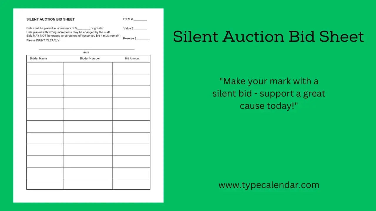
A well-built silent auction template keeps the event readable, fair, and easy to run, which matters more than people expect when the room gets busy and volunteers start juggling questions, pens, and checkout. In practice, the best version is less about decoration and more about structure: item details, pricing rules, bidder tracking, and a clean finish at the end of the night. I’m focusing here on what actually helps a community fundraiser raise money without turning the auction table into a bottleneck.
What a strong auction packet needs to do
- Put the item name, value, rules, and bidder space in one place.
- Capture donor information early so cataloging and receipts do not become a scramble.
- Keep bid increments, closing time, and winner details consistent across every item.
- Work for paper, digital, or hybrid events without forcing volunteers to improvise.
- Make the auction feel organized enough that guests can focus on the cause, not the process.
What belongs in a strong auction template
I like to think of the template as a small system, not a single sheet. The bid page is the most visible part, but the item intake form and checkout notes matter just as much because they prevent gaps later. When those pieces work together, the event feels calmer and the fundraising team spends less time decoding handwritten notes after the room clears.
| Page | Purpose | Must include |
|---|---|---|
| Bid sheet | Lets guests place bids quickly and correctly | Item number, item name, short description, fair market value, starting bid, bid increment, bidder space |
| Donation intake form | Collects item details before the catalog is built | Donor name, business name, contact information, item description, approximate value, delivery deadline |
| Checkout sheet | Speeds payment and winner handoff | Winning bidder, final bid, payment status, pickup notes, contact details |
| Volunteer guide | Keeps staff aligned on rules and responsibilities | Closing time, escalation contact, bid rules, item labels, backup procedures |
One detail I would not skip is the pricing logic. A practical rule of thumb is to set starting bids around 30% to 50% of fair market value, then use increments that keep bidding moving without making the ladder feel too steep. For many items, that means increments around 10% of value or a simple dollar step such as $5, $10, or $20. I also find that most bid pages are fine with 10 to 15 bid lines; I only stretch to 20 when the item is likely to draw a crowd.
That combination is simple, but it does a lot of heavy lifting: guests know what they are bidding on, staff know how to process it, and donors can see that the event is being handled professionally. From there, the next question is format, because the best layout changes depending on how the event itself runs.
How to tailor it to the way your event actually runs
Not every fundraiser needs the same level of complexity. A school dinner with 18 auction items, for example, can run smoothly on paper if the template is clean and volunteers are well briefed. A larger gala with dozens of items and a crowded checkout area usually benefits from digital bidding or a hybrid setup. In 2026, I usually think in terms of fit rather than fashion: use the format that reduces friction for your team and your guests.
| Format | Best for | Where it struggles | Template changes needed |
|---|---|---|---|
| Small to mid-sized in-person events with limited tech needs | Manual tracking, handwriting issues, slower checkout | Larger type, clear item numbers, enough bid lines, space for legible names | |
| Digital | Larger events, mobile-first audiences, faster payment workflows | Requires connectivity and a little more setup discipline | QR codes, synced item records, bidder IDs, payment fields |
| Hybrid | Community events that want paper visibility with digital efficiency | More planning up front | Printed display cards plus a digital source of truth for bids and winners |
If I had to give one practical recommendation, I would say this: use paper when the event is intimate and the team is small, but move to hybrid as soon as the item count, guest count, or checkout pressure starts to rise. Pure paper looks simple at the start and messy at the end; hybrid takes a little more preparation, but it usually protects the volunteer team from overload.
The pricing fields that protect revenue without slowing bidding
Pricing is where a lot of auctions quietly lose money. If the opening bid is too high, no one starts. If it is too low, the item may close below its real appeal. The strongest templates make pricing visible and consistent so that each item has the same basic logic, even if the final amount depends on the crowd in the room.
Use fair market value as a reference, not a decoration
Fair market value gives bidders a frame of reference and helps the event team justify the opening price. In U.S. nonprofit fundraising, I treat it as a practical field rather than a bureaucratic one: it helps people understand the item, and it keeps the auction from feeling arbitrary.Set increments that feel natural to the item
Low-value items usually move better with small dollar steps, while higher-value packages can handle larger jumps. A bottle basket may need a $5 raise; a vacation package can take $25 or more without losing momentum. What matters is consistency. Guests should never have to guess whether the next bid is valid.
Use examples to keep the math simple
| Item type | Fair market value | Starting bid | Increment |
|---|---|---|---|
| Wine basket | $50 | $20 to $25 | $5 |
| Spa package | $250 | $75 to $125 | $10 to $25 |
| Weekend getaway | $1,000 | $400 to $500 | $25 to $50 |
These are starting points, not rigid rules. High-demand items can justify the upper end of the range because the emotional pull is stronger, and the room will often push the price farther than a spreadsheet predicts. I would rather see a template that encourages disciplined judgment than one that pretends every item should be priced the same way.
Design choices that keep volunteers and bidders moving
Layout matters more than people admit. A crowded sheet under banquet lighting creates hesitation, and hesitation slows bidding. I prefer a design that looks almost plain at first glance, because plain is easier to read, easier to explain, and easier to process when guests are standing in line with drinks in one hand and a pen in the other.
Keep the page readable from a standing position
- Use a large item title and avoid decorative fonts that blur under low light.
- Leave enough white space so the item description does not collapse into a wall of text.
- Make the item number obvious and repeat it on the display card, not just the bid page.
- Use strong contrast between text and background so the sheet is readable from a few feet away.
Make the rules visible before anyone bids
- Show the closing time near the top of each page.
- State the minimum bid increment directly on the sheet.
- Include the bidder name or bidder number field in a consistent place.
- Add a simple note for tie handling or late bids if your event uses one.
Read Also: Silent Auction Rules - Maximize Bids & Ensure Fairness
Build for the volunteer who has never seen the event before
- Include a one-line guide for how to collect, file, and close the sheet.
- Keep a backup copy of every item record at registration or checkout.
- Use the same item naming convention across the catalog, table card, and checkout log.
- Assign one person to resolve messy handwriting or incomplete bids before the auction closes.
If a template only works when the original creator is in the room, it is not really a good template. The best version survives handoffs, volunteer turnover, and a slightly chaotic event floor. That is exactly what a community fundraiser needs, because the mission should stay visible even when the logistics get noisy.
Common mistakes that quietly cost money
- Hiding the value field. Guests bid with more confidence when they can see what the item is worth, and the template should make that information easy to find.
- Using too little space for bids. A sheet with 5 or 6 lines may look tidy, but it can kill momentum on a popular item before the room has settled in.
- Using too much space for bids. Too many blank lines can make the sheet feel unwieldy, especially on lower-value items that will never need them.
- Mixing item descriptions across pages. If the catalog says one thing and the bid sheet says another, checkout becomes slower and mistakes become more likely.
- Skipping the checkout workflow. Winning a bid is only half the job; the template should make payment, pickup, and receipt handling obvious.
I have also seen events lose time because the donation form was too sparse. If you do not collect donor name, item name, approximate value, contact information, and delivery timing up front, someone on the event team ends up reconstructing the record later. That is avoidable friction, and it is exactly the sort of thing a well-designed packet should remove.
The small details that make the auction feel cared for
If I had to narrow the whole process down to a few priorities, I would start with item clarity, bid rules, and checkout flow. Those three pieces are doing most of the work, even if they do not look glamorous on the page. Everything else is support.
- Finalize item names and numbers before printing anything.
- Check every value field against the donor record so the catalog and sheet match.
- Test the layout on actual paper, not just on screen, because spacing changes once it is printed.
- Place the bid sheet next to the item or QR code where guests can reach it without asking for help.
- Train one volunteer to close out each table so the end-of-night process does not become a pileup.
For a community-centered event, that level of care matters. It signals respect for donors, gives bidders a smoother experience, and keeps the focus on the cause instead of the paperwork. A strong template does not just organize the auction; it helps the event feel trustworthy, which is often what turns a good fundraiser into a memorable one.