Strong raffle ticket templates do more than look polished. They help a fundraiser collect money cleanly, track entries without confusion, and keep the drawing easy to explain on event night. For community galas, school events, and auction tables, the best layout is the one people can read fast and staff can manage without extra steps.
Key points to keep the tickets useful on event night
- A good layout balances branding with operational clarity.
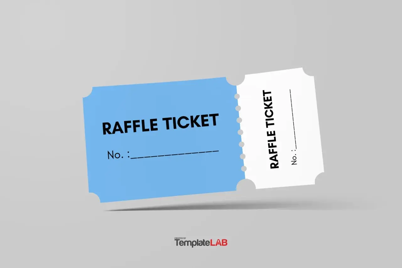
- Most U.S. events work well with a two-part perforated ticket around 2 x 5.5 inches or a similar compact size.
- The stub should only carry the fields you will actually use when selling, sorting, or calling a winner.
- For raffles tied to galas or auctions, readability matters more than decoration.
- State and local raffle rules can change what must appear on the ticket, so compliance should shape the design before printing.
What a good ticket has to accomplish
I treat a raffle ticket as a tiny operations document. It has three jobs: identify the event, separate the buyer’s copy from the organizer’s stub, and keep numbers consistent from the first sale to the last drawing. If a layout only looks festive but slows down check-in or entry sorting, it is not doing its real job.
| Feature | Why it matters | What I recommend |
|---|---|---|
| Perforated stub | Lets the buyer keep proof while the organizer keeps the entry | Use it for most live raffles and gala drawings |
| Sequential numbering | Prevents duplicate entries and makes reconciliation possible | Number every ticket in one clean run |
| Clear event identity | Shows exactly which fundraiser the ticket belongs to | Include the event name and organization name prominently |
| Readable prize language | Helps guests understand what they are entering for | List the main prize or the drawing purpose in plain English |
| Room for contact details | Makes winner follow-up easier | Ask only for the details staff will actually use |
Once that structure is clear, the next decision is format: what shape the ticket should take for the kind of event you are running.
Which format fits your event
The format should match how people will actually buy and submit entries. A school raffle selling from a clipboard needs a different layout than a gala with a silent-auction table or a 50/50 drawing at the end of the night. I usually compare formats by speed, visual polish, and how easy they are to reconcile after the event.
In the U.S., I often see finished ticket sizes around 2 x 5.5 inches or 2.125 x 5.5 inches, usually with a perforated stub. That compact size fits a pocket, a purse, or a volunteer sales book without feeling awkward.
| Format | Best for | Strength | Tradeoff |
|---|---|---|---|
| Two-part perforated ticket | Most raffles, galas, and school fundraisers | Familiar, easy to hand out and collect | Needs a little more setup than a plain slip |
| Booklets with ticket blocks | Volunteer-driven sales teams | Easy to distribute and track by seller | Bulkier to manage at the start |
| Single-sheet or roll tickets | Door prizes, casual events, quick sales | Fast and inexpensive | Less polished and usually less flexible |
| Color-coded tickets | Silent auctions, basket draws, multiple prize pools | Makes sorting and drawing easier | Requires strict color control |
| Hybrid ticket with QR code | Galas with mobile bidding or online follow-up | Bridges printed and digital workflows | The QR code has to lead somewhere useful |
I usually reach for an editable PDF when the layout is fixed and a Word or browser-based file when multiple people need to update names, dates, or prize text quickly. The tool matters less than whether the final print keeps spacing, numbering, and margins intact. The most important design choice after format is what information the ticket actually carries.
What to print on the ticket and the stub
I never start with decoration here. I start with the minimum information a volunteer needs and the minimum information a winner needs. In the U.S., some jurisdictions require the drawing date, time, and location, the organization name, ticket price, prize details, and sometimes a permit or license number, so the layout should reserve space for local rules instead of assuming a universal checklist.
| Item | Put it on | Why it belongs |
|---|---|---|
| Organization name | Main ticket | Identifies the fundraiser immediately |
| Event name | Main ticket | Ties the entry to one specific drawing or gala |
| Draw date, time, and location | Main ticket | Clarifies when and where the winner will be selected |
| Ticket number | Both parts | Lets staff match the buyer copy to the organizer copy |
| Ticket price | Main ticket | Prevents confusion when volunteers sell in multiple places |
| Prize description | Main ticket | Sets expectations and helps the drawing feel transparent |
| Buyer name and contact method | Stub | Makes winner follow-up possible |
| Permit or license number, if required | Main ticket or footer | Supports compliance where local rules ask for it |
If the stub has to do double duty as a contact form, keep the fields short. Name plus one reliable contact method is usually enough. The more fields you ask for, the slower the line moves, and that slowdown matters on a crowded fundraiser floor. Once the content is right, the next job is to make it readable at a glance.
How to design for visibility and trust
I prefer a ticket that is calm and obvious over one that is overloaded with color. When guests are moving through a crowded hall, they should find the event name, prize, and number in a second or two. That means one strong type hierarchy, enough white space around the perforation, and contrast that survives cheap office printing.
- Put the event name and prize at the top, then follow with the price and date.
- Keep the main text around 10 to 12 pt and avoid shrinking legal lines until they disappear.
- Use one headline style, one body style, and no more than two or three colors.
- Make the ticket number large enough to read at check-in without squinting.
- Place any QR code where it supports a clear action, such as bidding, donor info, or digital check-in.
- Keep important text away from the perforation so it does not get lost when tickets are torn apart.
Brand accents still matter. A logo, a sponsor mark, or a signature color can make the ticket feel connected to the event, but I would rather print a plain ticket that works than a decorative one that confuses volunteers. A clean design is still only useful if it prints correctly, which is where production choices matter.
Printing choices that prevent delays
For small runs, I like editable layouts that print on cardstock at home or in the office. For bigger fundraisers, I lean toward professional printing because it gives you consistent perforation, clean numbering, and fewer surprises when the tickets are stacked, stapled, and sold in books. In practice, once you are printing hundreds of tickets, the time saved by not fighting the printer usually matters more than the cost difference.
| Production choice | Best when | Advantage | Watch out for |
|---|---|---|---|
| Home or office printing | Small events and last-minute updates | Fast edits and low overhead | Printer jams, color drift, and uneven cuts |
| Commercial printing | Larger runs or premium galas | Better consistency and cleaner finishing | Lead time and higher unit cost |
| Perforated sheets | You want easy tear-off handling | Simple for volunteers to separate and file | Not every printer feeds them well |
| Books of tickets | Teams are selling in multiple locations | Easy to assign blocks to specific sellers | Needs tracking so ranges do not overlap |
- Print one proof on the actual paper before you commit to the full run.
- Check that the numbering sequence is intact from the first sheet to the last.
- Test the perforation and trim against a real stack, not just a single page.
- Order or print about 10% extra to cover spoilage, misfeeds, and late additions.
- Pack tickets in manageable blocks if volunteers will hand them out during a live event.
Once the production side is stable, the final question is how the tickets support the event itself.
Where the format works best in real fundraisers
Different fundraising settings need different layouts, and that is especially true when raffles sit alongside auctions. At a gala, the ticket often acts like a polished receipt. At a school fair, it is more of a working form. At a silent auction, it may need to sit comfortably beside bid sheets and prize tables without creating extra confusion.- Community gala: I would keep the design polished, use a clear number, and add a QR code only if it leads to mobile bidding or donor follow-up.
- School fundraiser: I would make the copy simple, leave room for parent contact details, and use a bold number that volunteers can sort quickly.
- Silent auction or basket raffle: I would color-code the entries by prize table or drawing category so volunteers do not mix them up.
- 50/50 drawing: I would strip the layout down to the essentials and make the payout rules unmistakable.
Those use cases sound simple, but the wins usually come from small operational details rather than from fancy graphics. When the ticket fits the event, staff spend less time deciphering slips and more time raising money for the cause.
The small details that keep the night moving
If I were printing a new set this week, I would focus on four things before anything else: numbering, legibility, a stub that staff will actually use, and rules that match the local jurisdiction. The best raffle ticket templates are the ones that support the drawing without creating extra work. When the layout is right, volunteers can move faster, buyers feel confident, and the fundraiser looks organized from the first sale to the final draw.
- Use sequential numbers you can reconcile later.
- Keep the stub short enough that people finish it quickly.
- Reserve space for local compliance text instead of squeezing it in at the end.
- Test one full sheet or one full book before committing to the whole run.
That is the real test: a ticket that disappears into the flow of the fundraiser and helps the cause move faster.