The essentials that make a bid sheet work
- A good form captures the item, the bidder, the bid amount, and the closing time without making guests hunt for instructions.
- The cleanest layouts use a clear item code, a short description, a starting bid, a bid increment, and space for winner contact details.
- Paper still works well for smaller in-room events, while digital bidding helps when speed, backups, and checkout automation matter more.
- A common pricing baseline is to start around 30% to 40% of fair market value, then adjust the increment to fit the crowd.
- The fastest way to lose money is to let the page get crowded, unclear, or inconsistent with the rest of the auction setup.
What a bid sheet has to do
I think of the form as three tools in one: a record, a guide, and a safeguard. It needs to capture each bid accurately, steer people toward the next valid offer, and make it possible to settle the auction without a long argument over handwriting or memory. In a community fundraiser, that matters because the sheet is part of the participant experience, not just an admin detail.
When the form is weak, people hesitate, bids slow down, and volunteers spend the last 20 minutes reconstructing what should have been obvious. When it is strong, the room moves almost on its own. That is why the page has to do more than collect numbers; it has to reduce friction from the first bid to the final checkout.
That practical role is where the design choices start to matter, because the next question is not just what the form does, but what it needs to say.
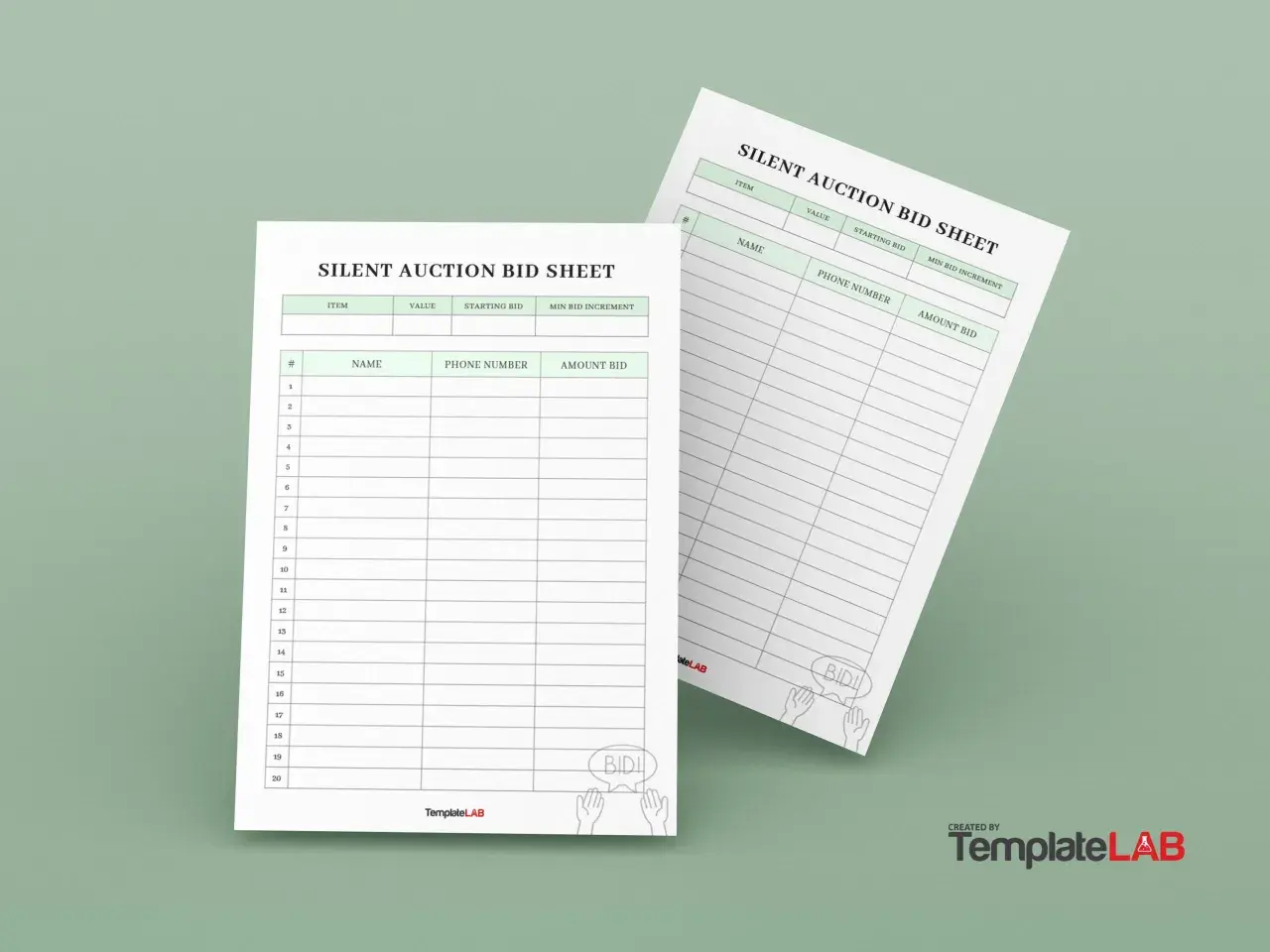
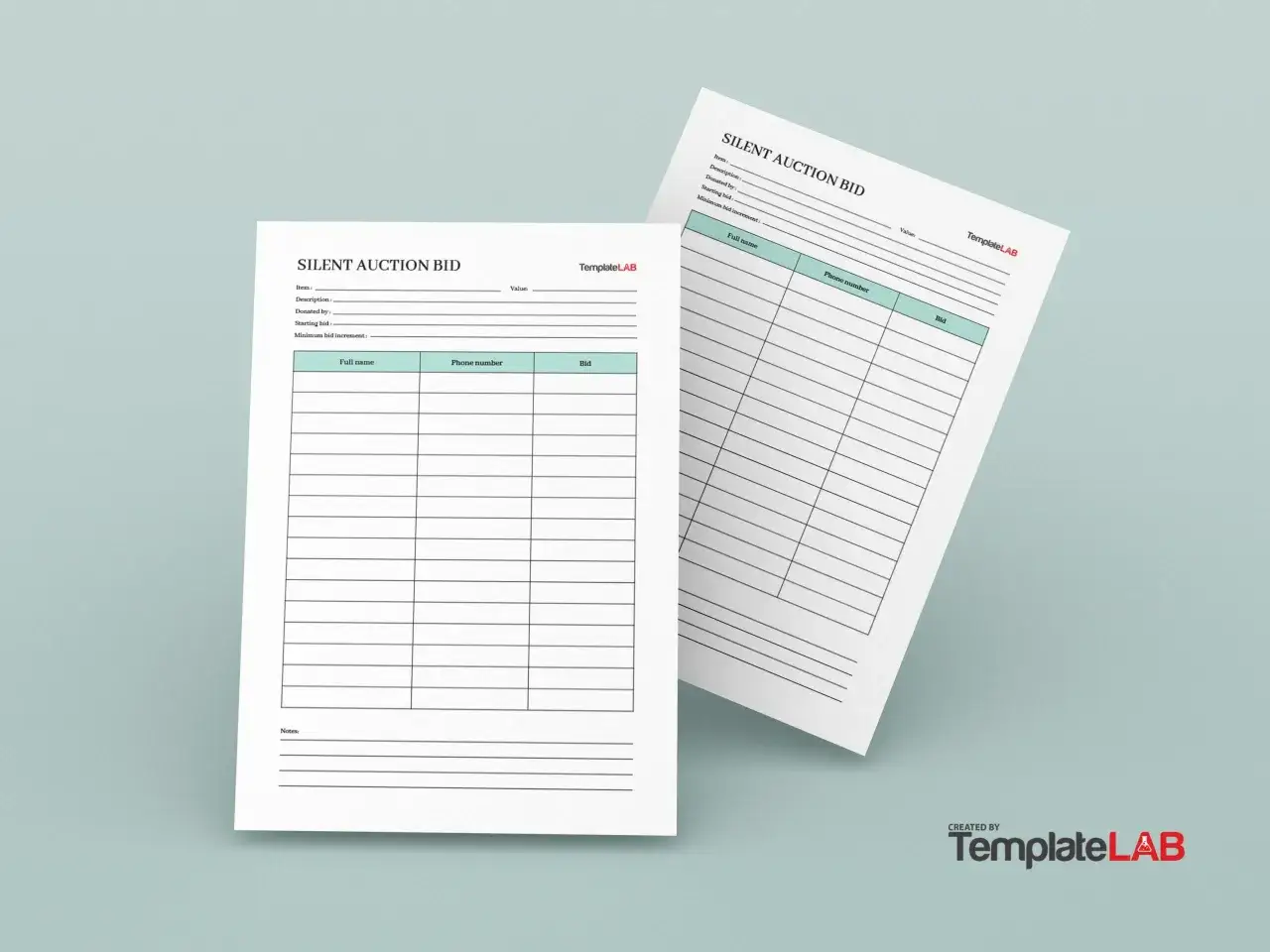
The fields I put on every sheet
Not every event needs every possible field, but the basic structure should always be easy to scan. I keep the details tight enough that a guest can understand the page in a few seconds and a volunteer can reconcile it later without guesswork.
| Field | What to include | Why it helps |
|---|---|---|
| Item number or code | A short identifier that matches the display card and checkout record | Prevents mix-ups when sheets are moved or separated from the item |
| Item title | A plain, specific name such as “Weekend cabin stay” or “Signed team jersey” | Lets guests spot the item instantly |
| Short description | Two or three lines covering what is included, restrictions, and expiration notes | Reduces confusion and later disputes |
| Estimated value or FMV | The item’s fair market value if your event wants that level of transparency | Helps set expectations, though some organizers keep it on the internal copy to avoid anchoring bids too low |
| Starting bid | The first acceptable bid amount | Gives guests a clear entry point |
| Bid increment | The minimum amount each new bid must exceed the last one by | Prevents tiny jumps that slow the room down |
| Bidder name or number | A full name for smaller events, or a bidder number for larger ones | Keeps checkout cleaner and faster |
| Bid amount and time | Enough lined space for multiple entries, plus timestamps if needed | Makes the winner easy to verify |
| Closing time | The exact time bidding ends for that item | Stops disputes over late offers |
| Pickup or redemption notes | Any shipping limits, pickup windows, or donor conditions | Protects the organization and the winning bidder |
I also like to separate public-facing information from back-office information. Bidder numbers and rules belong in the open, while payment status, receipt details, or internal notes can stay on the organizer copy. That separation matters more as the event gets bigger, which brings me to the part most people underestimate: layout.
How I lay out a form people can read in a crowded room
Good layout is about distance, speed, and pressure. A guest should be able to read the item title from a few feet away, understand where to write without asking, and move on before the line behind them turns impatient. I usually use one item per sheet, because bundling several items together saves paper but costs clarity.
- Put the item title, item number, and a small visual or donor note at the top.
- Leave the bidding area wide enough for 10 to 15 entries on a popular item, or use a continuation sheet instead of shrinking the font.
- Use a body font of at least 12 pt, with 14 to 16 pt for labels that need to stand out.
- Keep the instructions short and bold, especially around minimum bids, increments, and closing time.
- If the sheet is hanging on a wall or taped to a display table, position it where people do not have to bend or crowd the item to write.
For larger galas, I also prefer bidder numbers over full names on the public sheet. Numbers keep the page cleaner and speed checkout, while names can still live in the registration system or on the organizer copy. Once the layout is readable, the next decision is whether paper alone is enough or whether a digital layer will save time later.
Paper vs digital bidding and when each one wins
Paper is still the simplest option when the room is small, the internet is unreliable, or volunteers need something they can manage with a clipboard and a pen. Digital bidding is stronger when you want automatic timestamps, easier winner lookup, and fewer transcription errors at checkout.
| Criterion | Paper sheet | Digital bidding |
|---|---|---|
| Setup time | Fast and inexpensive | Slower first setup, but reusable |
| Best fit | Small or medium in-room events | Large, hybrid, or high-volume events |
| Main risk | Handwriting, lost pages, manual tallying | Login friction, Wi-Fi issues, device charging |
| Checkout | Manual but simple | Can sync winners and payments more cleanly |
| Guest feel | Tactile and familiar | Faster and more transparent |
In practice, the best setup is often hybrid. I like paper on the floor when guests are browsing and a digital record behind the scenes when the team needs a clean audit trail. That balance works especially well for nonprofit events, where a missed payment or a lost page can undo the good the night was meant to create. From there, pricing and increments decide whether the form actually drives bidding or just documents a slow room.
Pricing rules that belong on the sheet
The form should not force guests to guess the next valid amount. I make the starting bid and increment visible because they shape behavior before the first pen touches paper. A common baseline is to start at roughly 30% to 40% of fair market value for many items, then choose an increment that feels easy enough to beat without making the item look undervalued.
As a simple example, an item with a $200 FMV might start at $60 or $80, with $10 bids from there. A more premium package may need bigger jumps if the room is competitive, but I still try to keep the next step small enough that someone feels comfortable joining the bidding. In my experience, the right increment is the one that keeps momentum alive; if the jump is too large, the form looks quiet even when interest is real.
I also decide early whether to show value on the public sheet. Some organizers like the transparency, especially for community groups that want donors to understand the item; others leave the number off the display and keep it on the internal copy so bids are not anchored too low. Either approach can work, but the choice should be deliberate, because the form is already doing enough without sending mixed signals. That brings me to the mistakes that quietly cost money.
The mistakes that quietly cost money
- Too little space for bids means the form fills up early, which pushes guests to write in margins or on scrap paper.
- No item code creates problems when sheets are separated from the display item or moved during setup.
- Unclear close time leads to arguments, especially if people think a last-minute offer should still count.
- Inconsistent increments make some items feel unfair and others feel dead before they start.
- Handwriting that only one volunteer can read turns checkout into a decoding exercise.
- No backup copy is risky if a page gets torn, wet, or accidentally removed.
Most of these problems are preventable, and the fix is usually boring: simpler structure, larger type, and better matching between the display, the bid form, and the checkout list. Once those pieces line up, the auction feels more professional and the staff has room to focus on donors instead of damage control. The final pass is the one I never skip.
The last checks I make before doors open
Before guests arrive, I ask a simple question: if I handed this form to a volunteer with no context, would they know exactly what to do? If the answer is no, I simplify again.
- Match the item number on the display card, the bid form, and the checkout record.
- Print the closing time in large type, not as a footnote.
- Keep pens, tape, clipboards, and spare sheets close to the auction floor.
- Test whether the highest bid line is obvious even when the page starts to fill up.
- Make sure the organizer copy has any restrictions, pickup notes, or bidder contact details that the public sheet does not need.
That last step matters because the best fundraising nights feel calm, even when the bidding is lively. When the forms are readable, consistent, and easy to reconcile, the event gives more energy to the cause and less to the process, which is exactly where a community-focused auction should be.